Selected work · 2010–present
I build worlds, brands,
and the systems behind them.
My work begins with strong visual fundamentals and expands into brand development, creative leadership, and AI-powered production systems. Across each project, I define the vision, improve the process, and help teams turn ambitious ideas into cohesive experiences.
Art Direction · Visual Storytelling · IP Development · Creative Systems · AI Direction
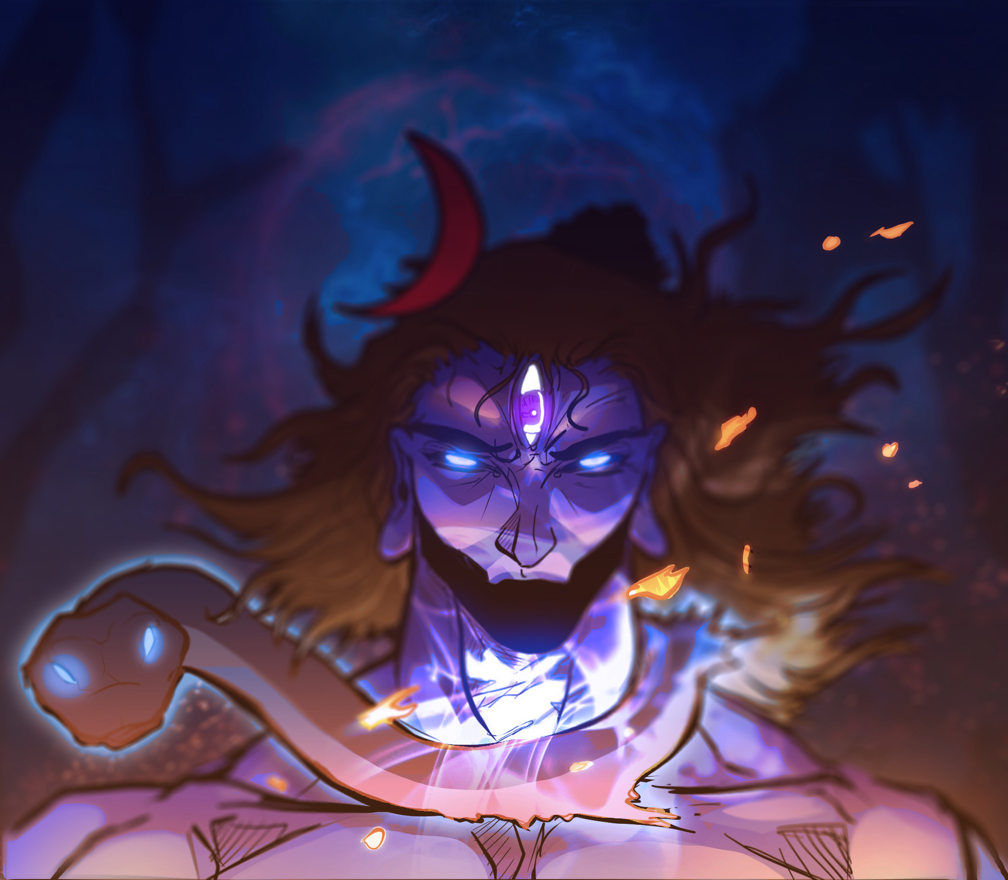
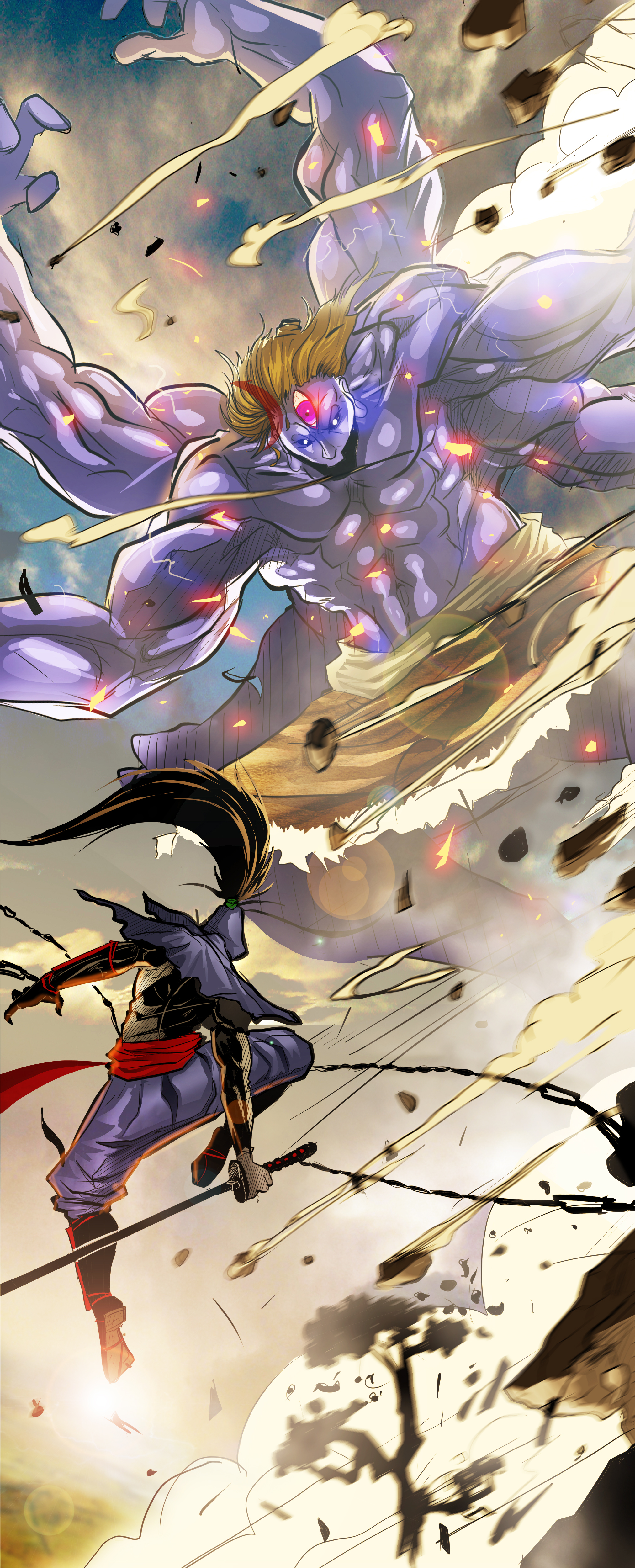
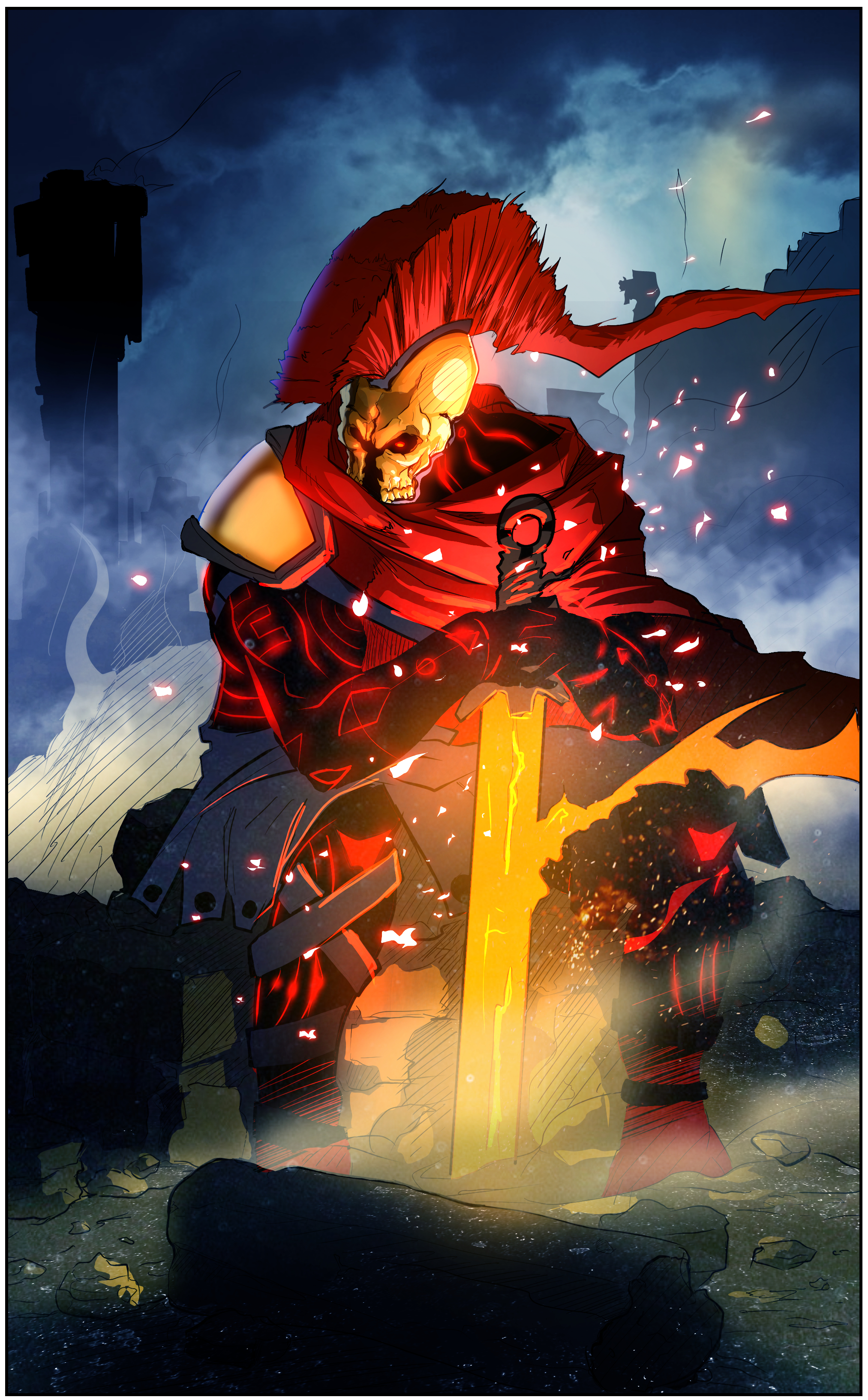
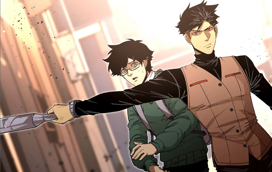
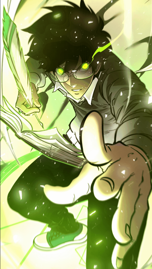
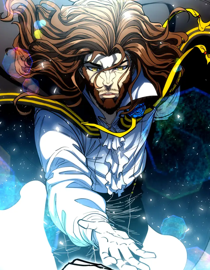
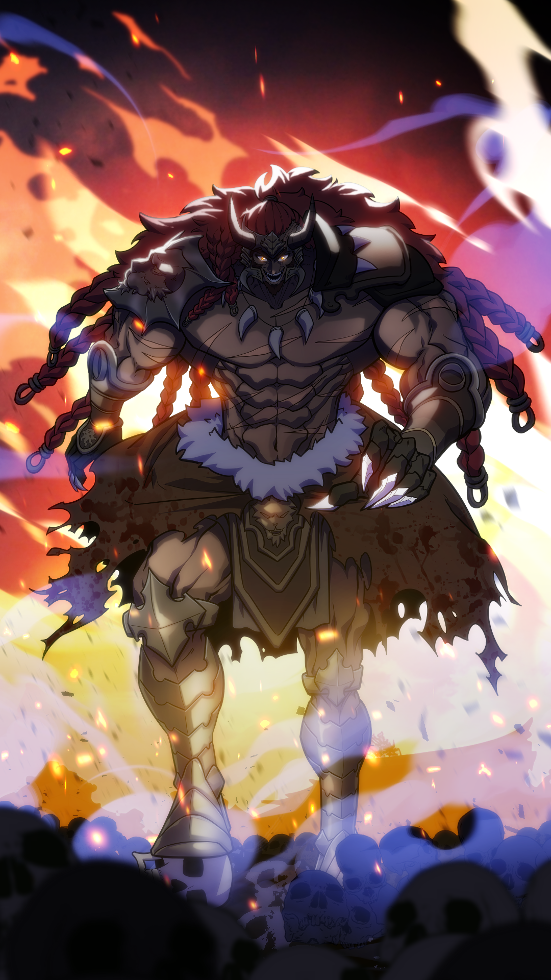
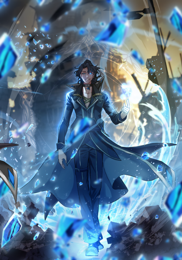
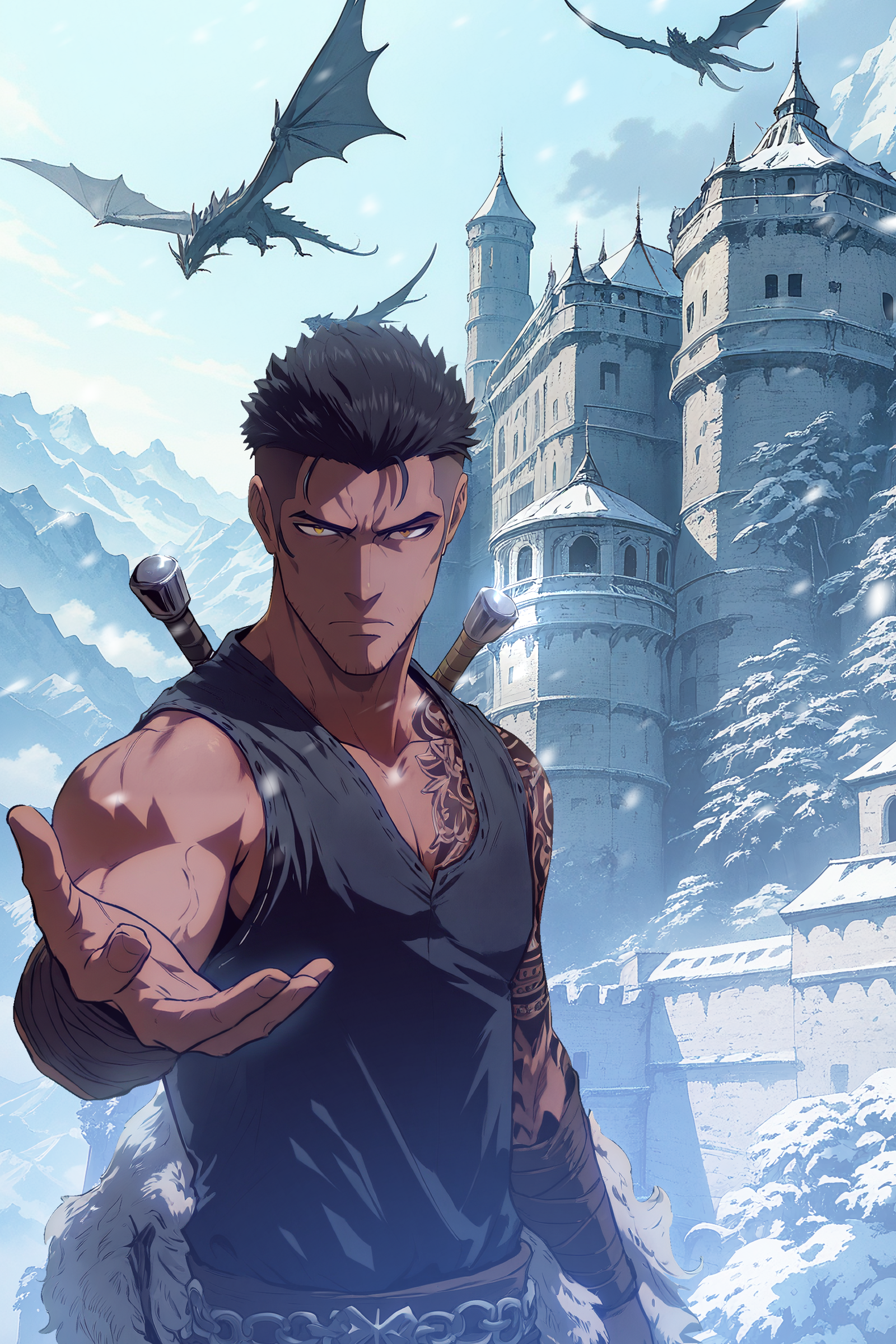
Building a cinematic webtoon through color, motion, and visual storytelling.
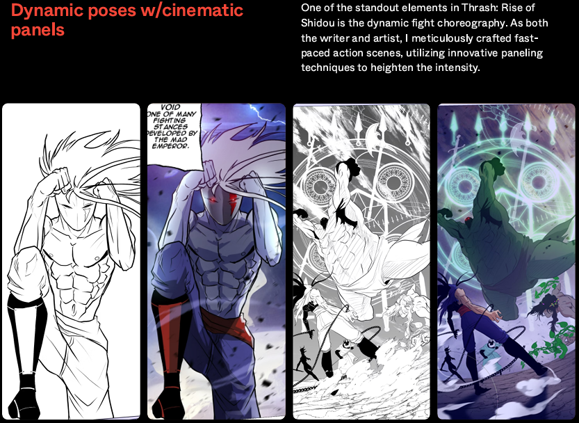
Dramatic lighting, dynamic camera angles, and action-driven composition built to make every panel feel like a shot in motion.
View full case study →
Directing an original IP from visual identity to audience growth.
A flagship original IP on VoyceMe — directed from visual identity through ongoing production.
View full case study →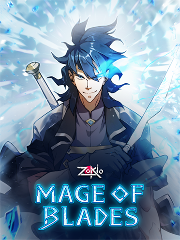
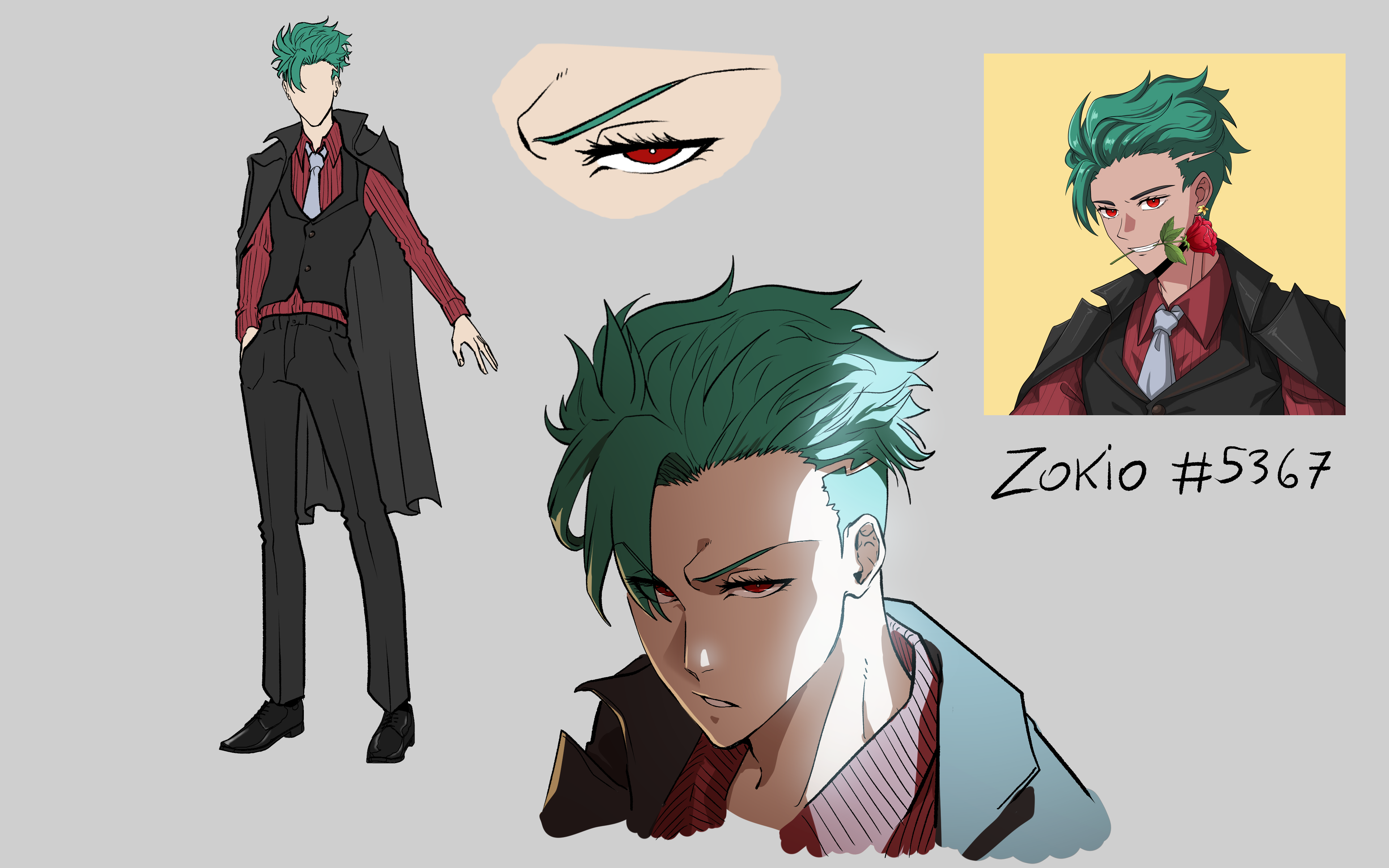
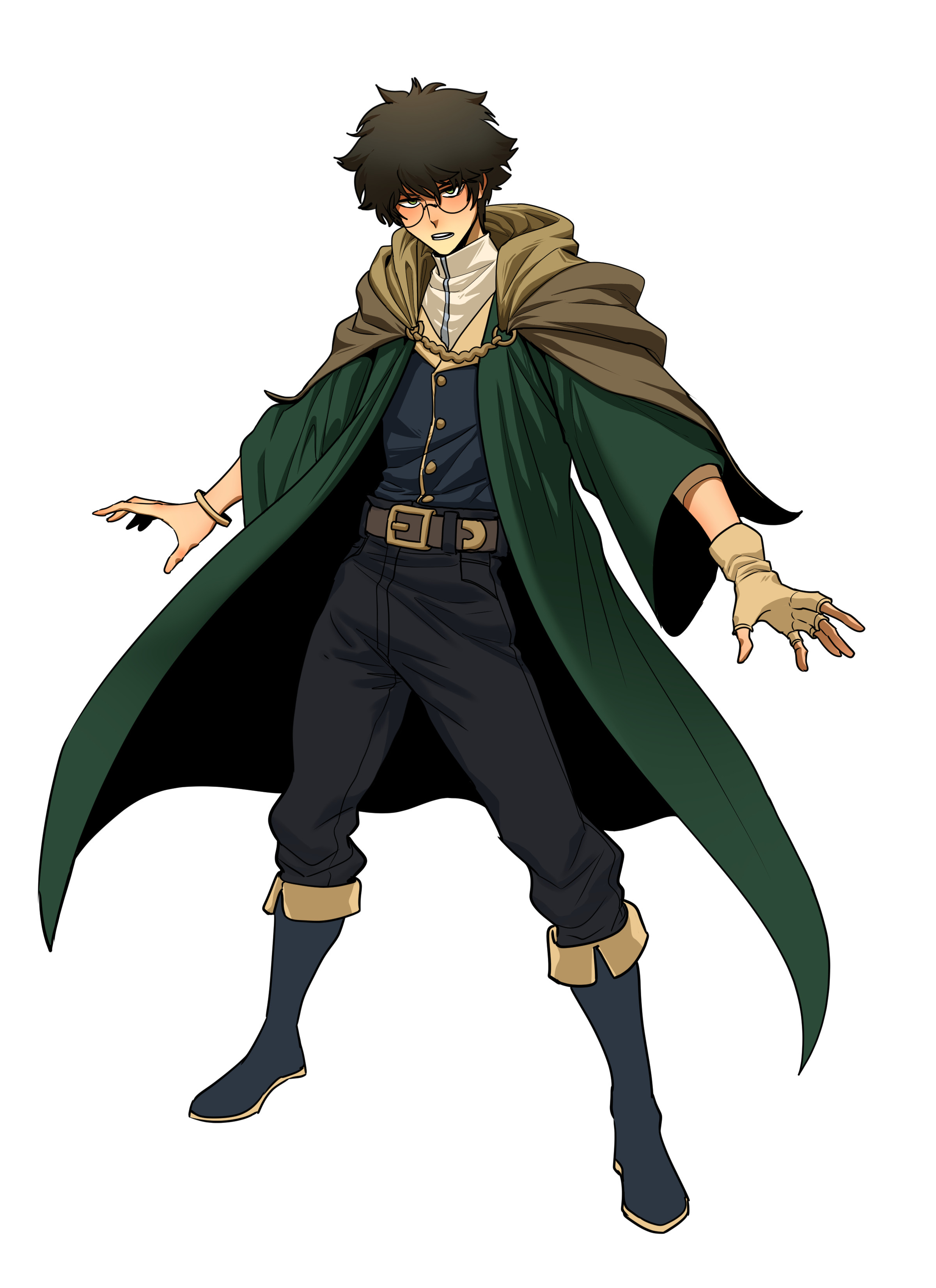
Art directing a hero for the Zokio NFT universe.
Draft-to-final review passes built around line of action, silhouette, and compositing to raise a single character illustration to franchise quality.
View full case study →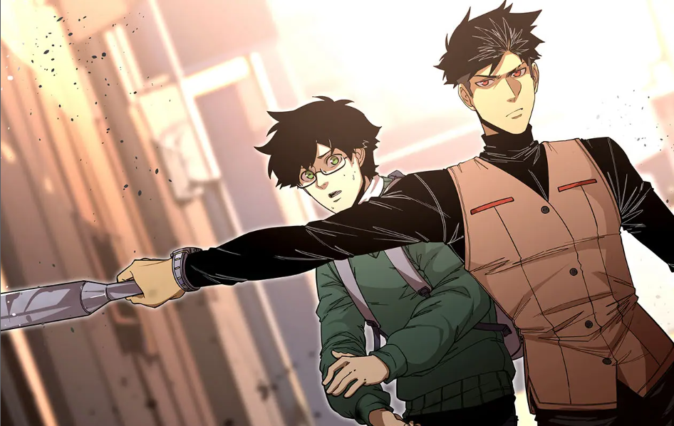
Building a full cast at scale with an artist-led AI pipeline.
Turnarounds, poses, and backgrounds for a large ensemble cast, produced with an ethically-trained creation tool that kept artists in charge of every output.
View full case study →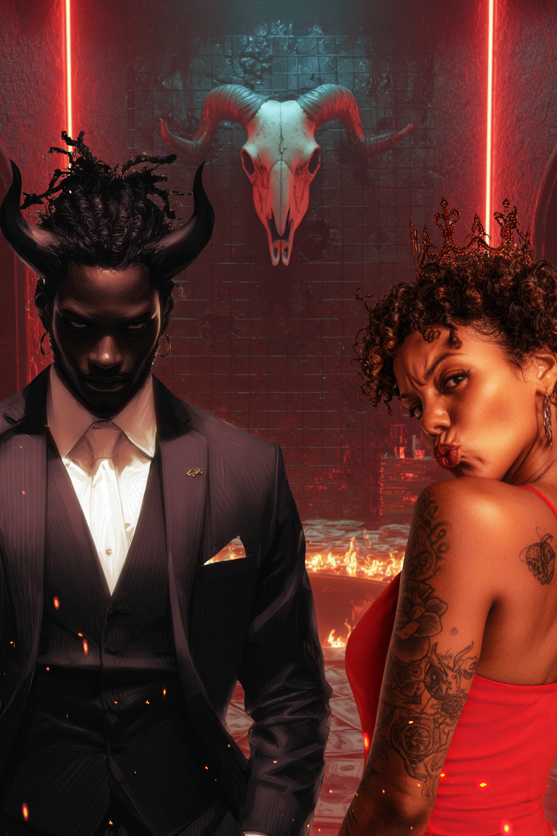
Giving generative storytelling a visual language.
Prompt systems, visual standards, and product concepts built to make AI creation feel cinematic, guided, and story-driven.
View full case study →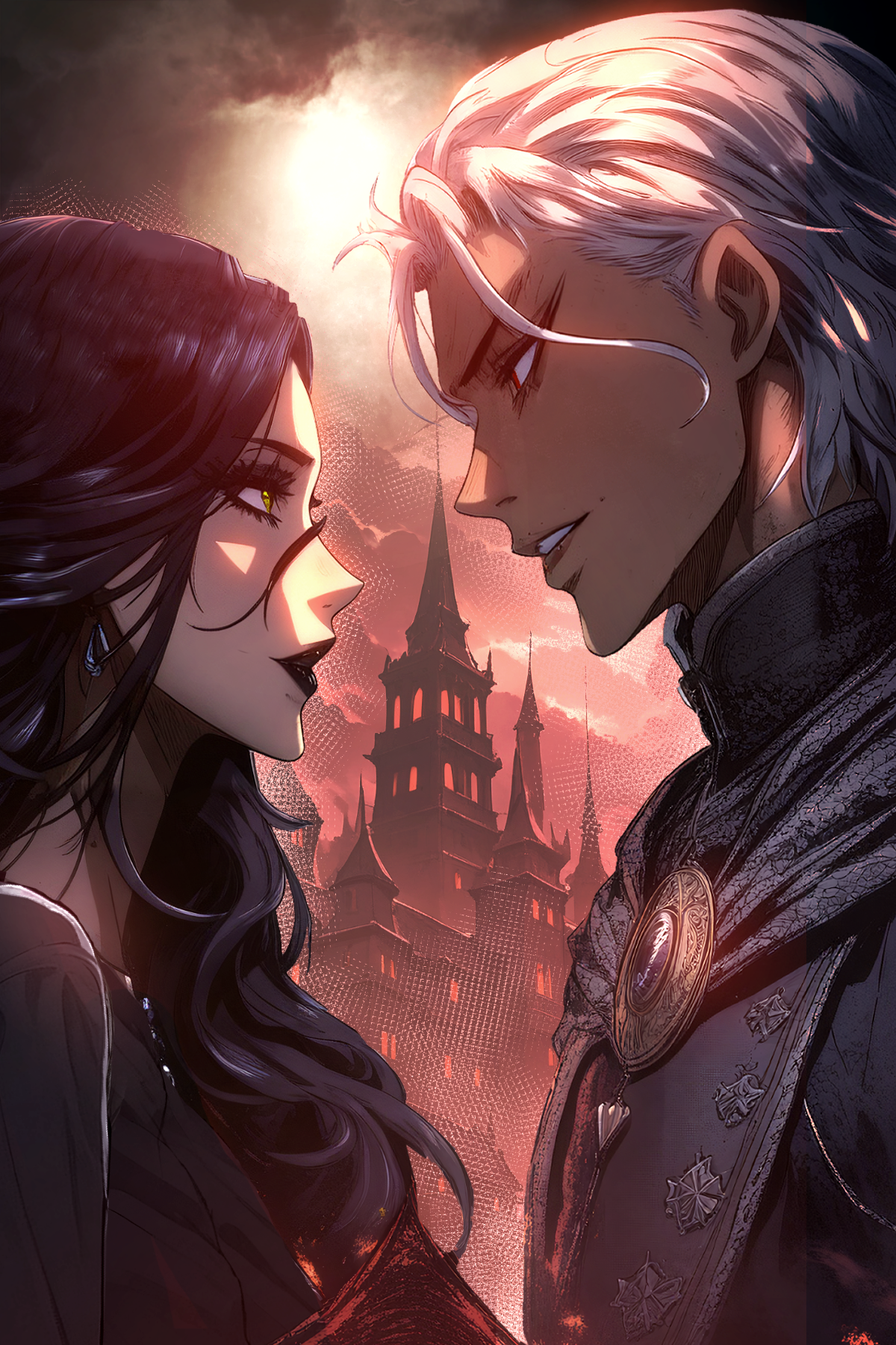
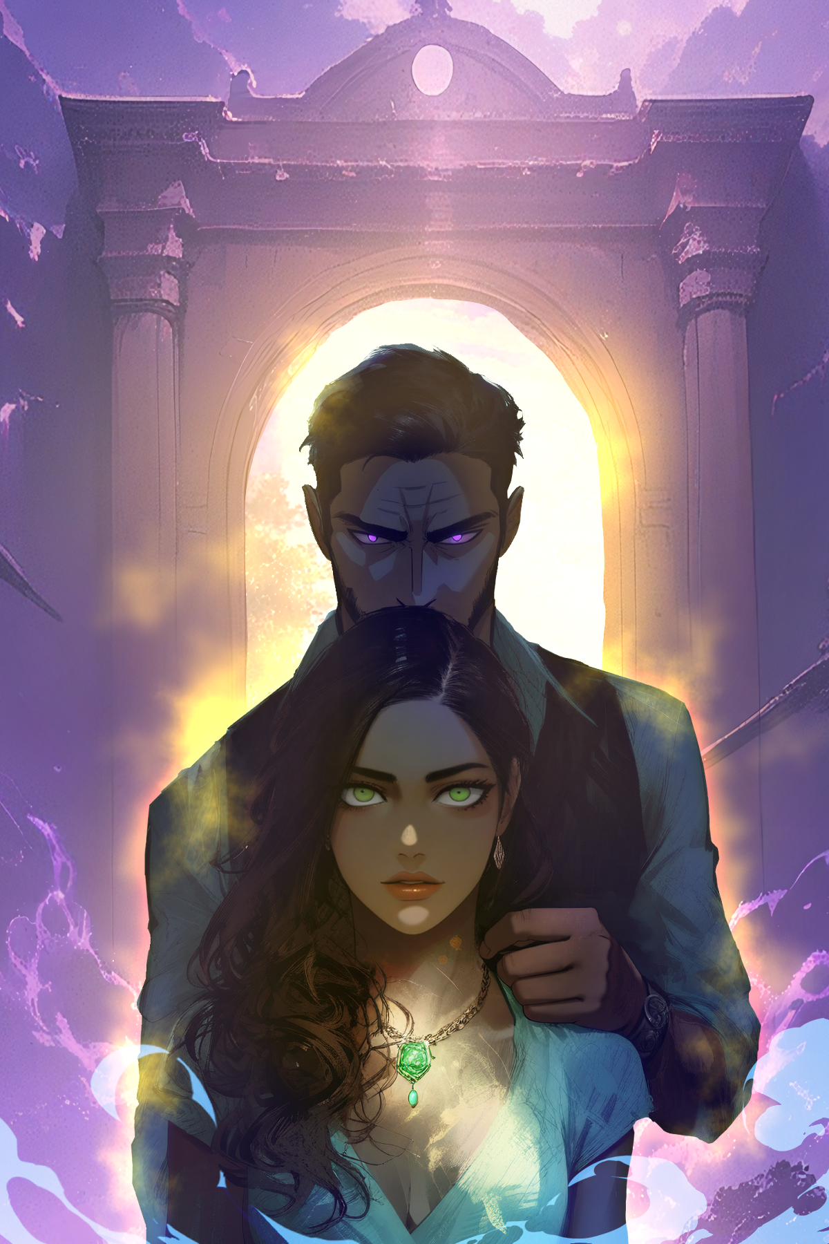
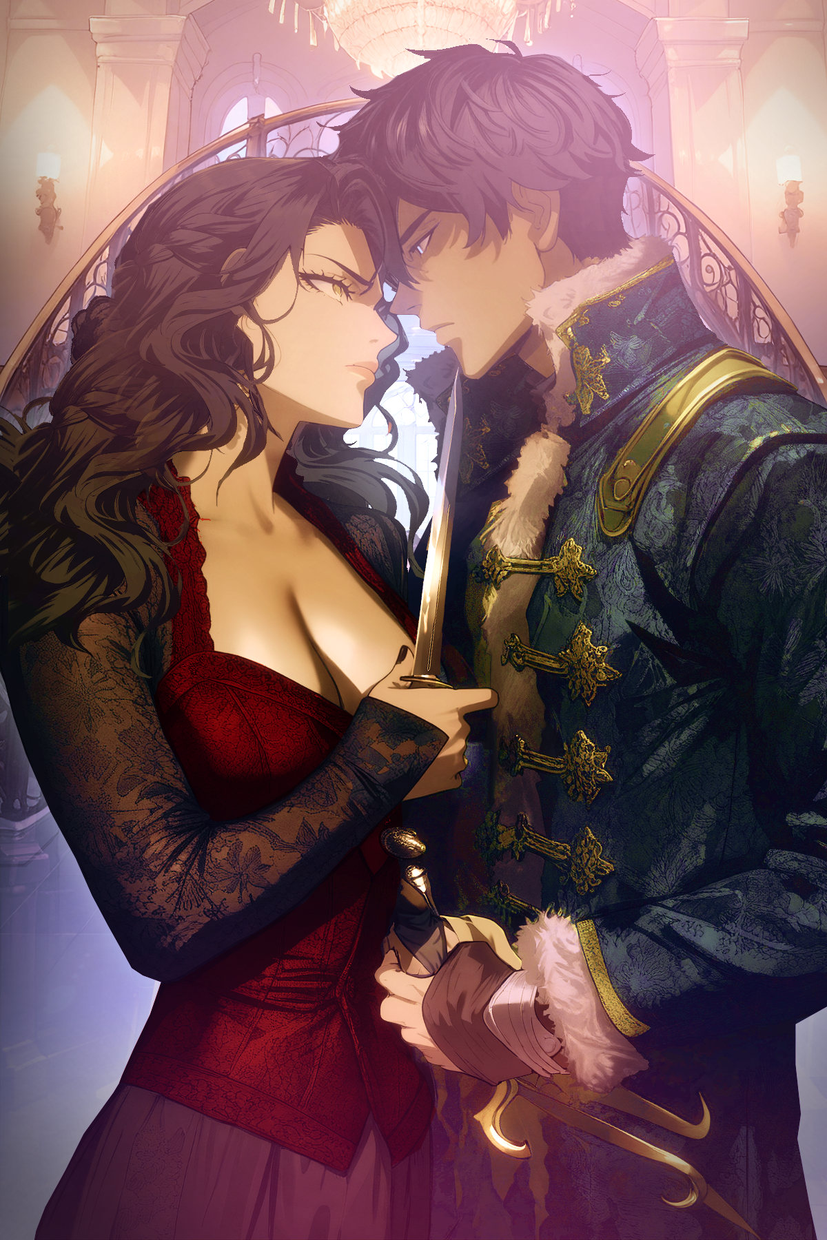
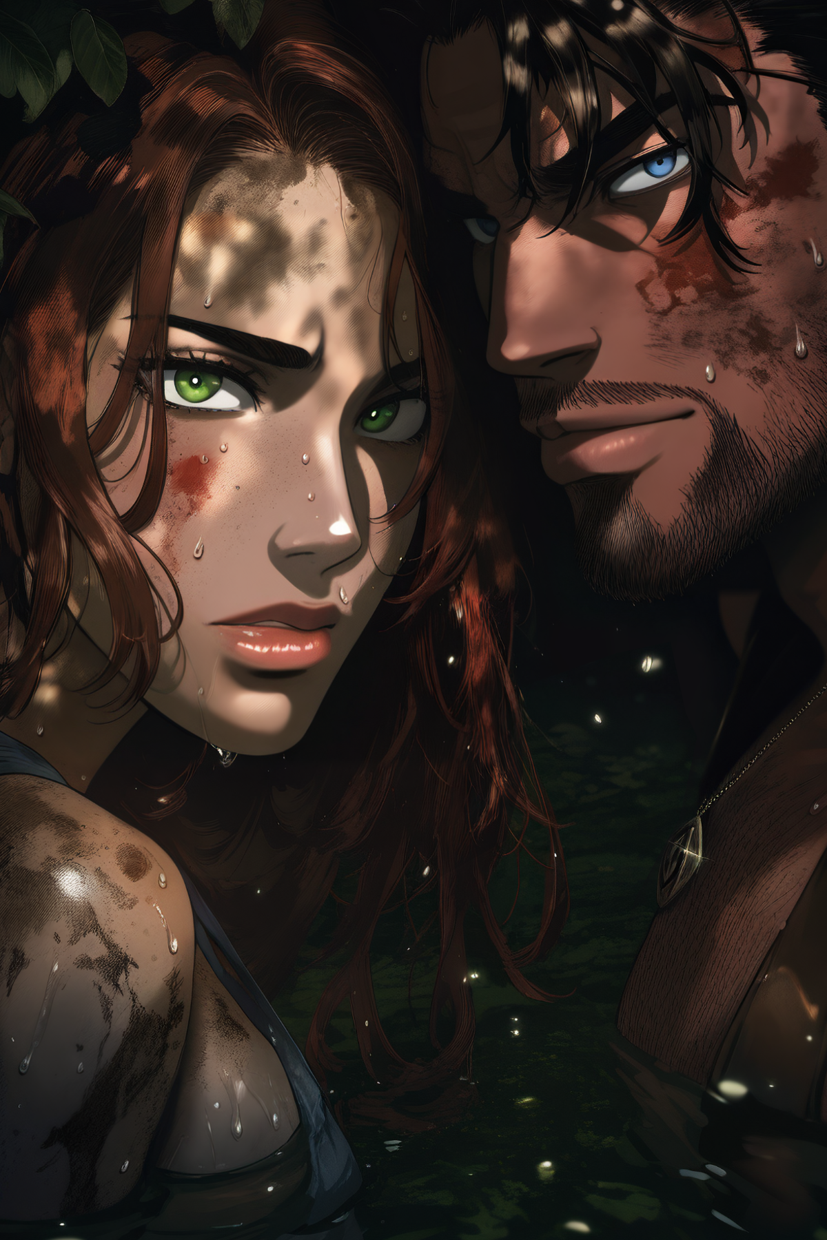
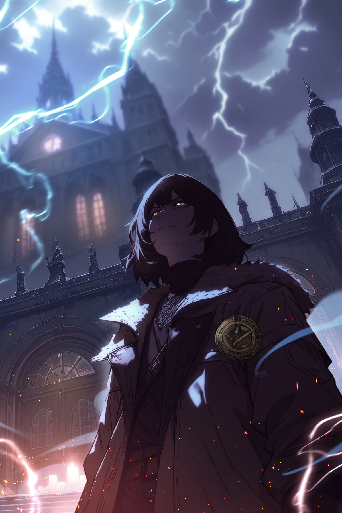
Resident cover artist for a community-written fiction platform.
Custom covers for authors whose stories the community voted to spotlight, each one built to capture a story's essence in a single image.
View full case study →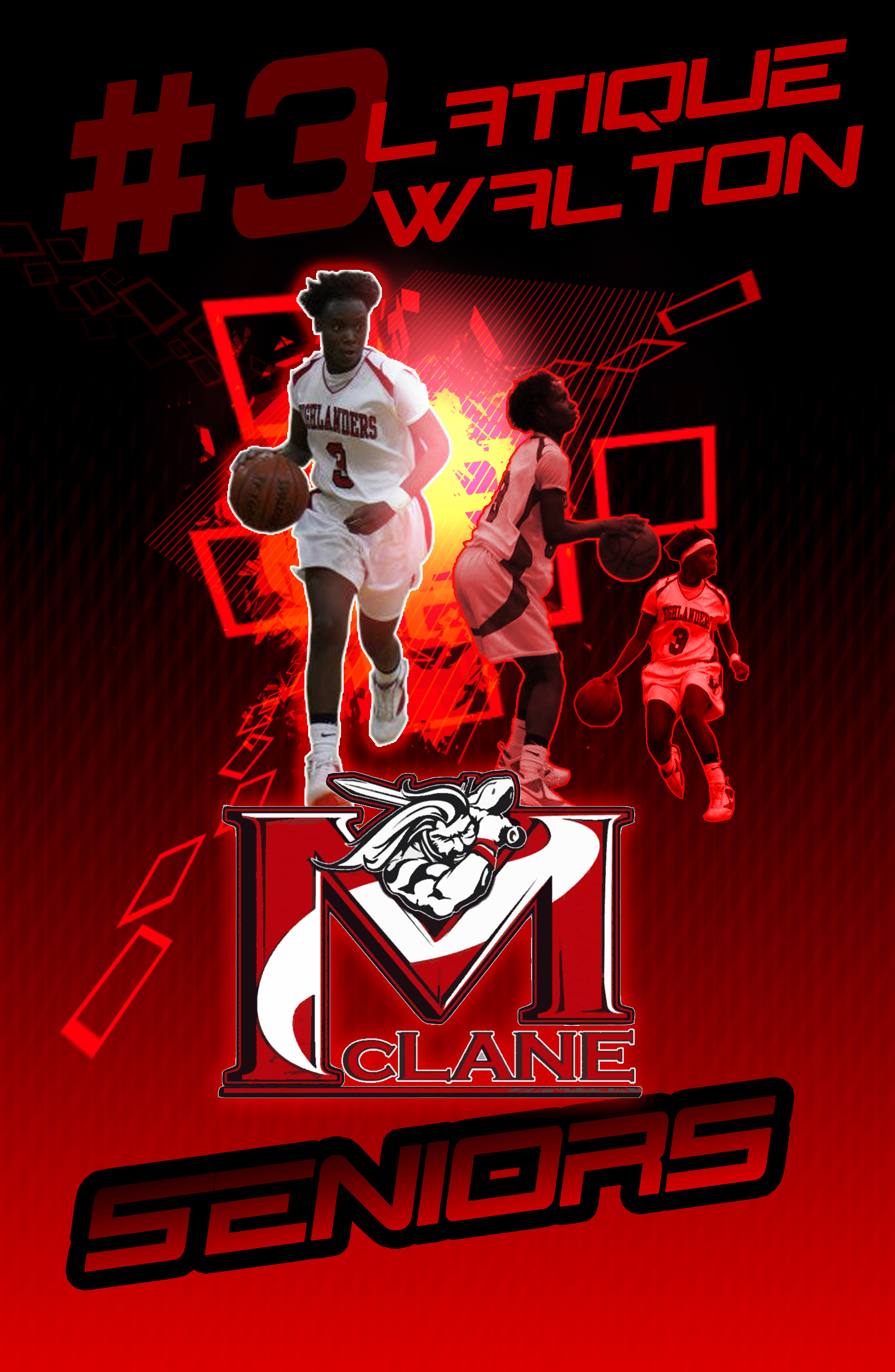
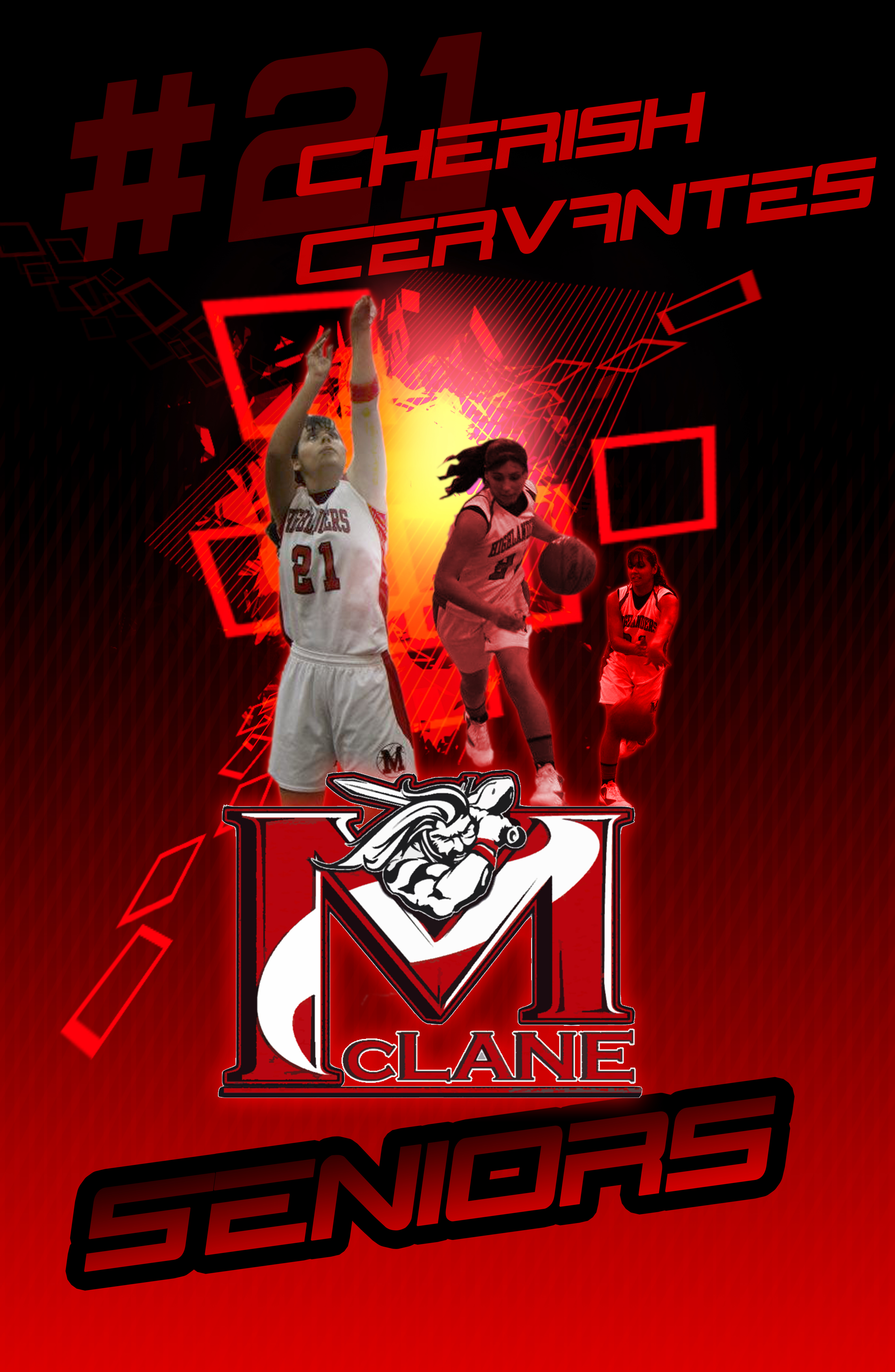
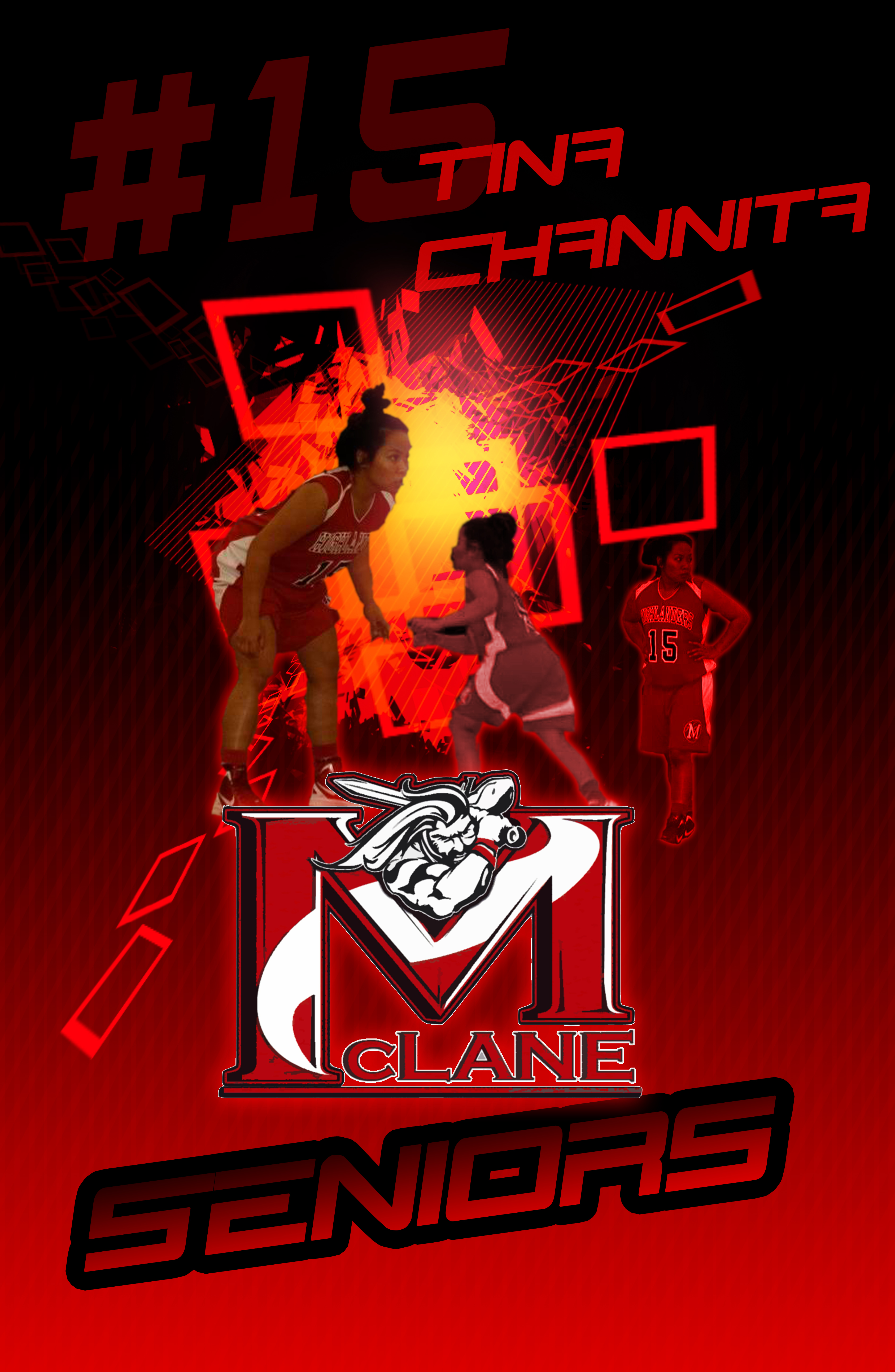
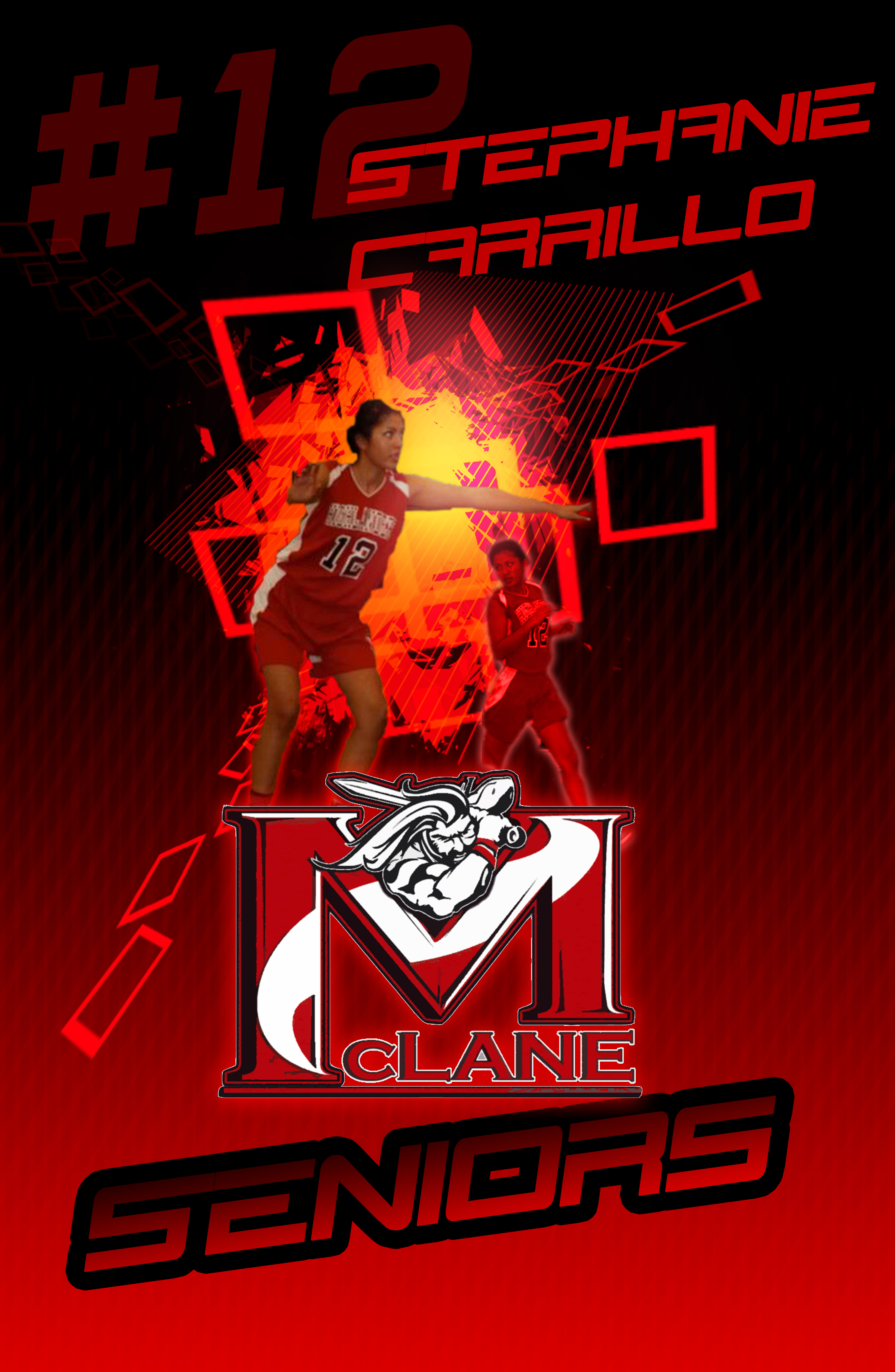
Senior night posters built for explosiveness.
A poster series honoring McLane High School's senior girls basketball team. One athlete each, tuned for impact from across a gym.
View full case study →Senior night posters built for explosiveness.
Sports Design · Photo Compositing · Print
The idea here was that Senior night is loud, fast, and over in an hour. The posters had to match that energy. Each poster takes a single athlete and turns her game footage into a burst of motion with shatter geometry, hot light, and a triple exposure that reads like three frames of one play collapsed into a single image.
High energy
Everything points outward from a blown-out core light. Diagonal shard fields and angled type push the eye up and off the page instead of settling it.
Explosiveness
Three cutouts of the same player, scaled and faded back into the red, read as one explosive movement rather than three separate photos.
One team, one system
A locked layout, number, name, athlete stack, Highlander mark, SENIORS!!! So every poster hangs together on the wall while each senior still gets her own hero shot.
The Series
Building Creative Systems
I led the development of the creative systems that made consistent, cinematic-quality imagery possible at scale. That meant founding three dedicated QA functions:
A Concept Team, a Narrative Analyst role, and a Cinematic Lighting & FX Team building an artist-trained generation tool and a shared asset library, and translating traditional cinematic language into prompt structures that teams and systems could use consistently.
Developing VoyceMe's Concept Team
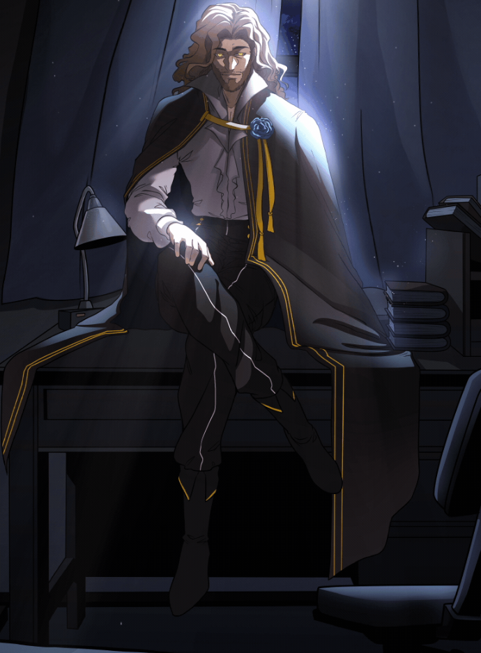
One of my primary initiatives was helping establish VoyceMe's internal Concept Team. Instead of artists beginning every illustration from a blank canvas, the Concept Team became responsible for solving visual problems before production began.
Their responsibilities included
Character exploration and iteration
Costume and silhouette development
Environment ideation
World-building assets
Prop design
Mood boards
Visual research
Color exploration
Production-ready concept sheets
This allowed production artists to spend more time creating polished artwork while ensuring visual consistency across entire series.
By separating concept development from production, we reduced creative bottlenecks while dramatically improving overall quality.
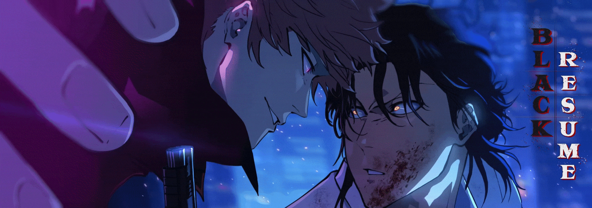
 Black Resume →
 God Game →
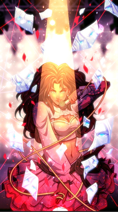 Survival Idol →
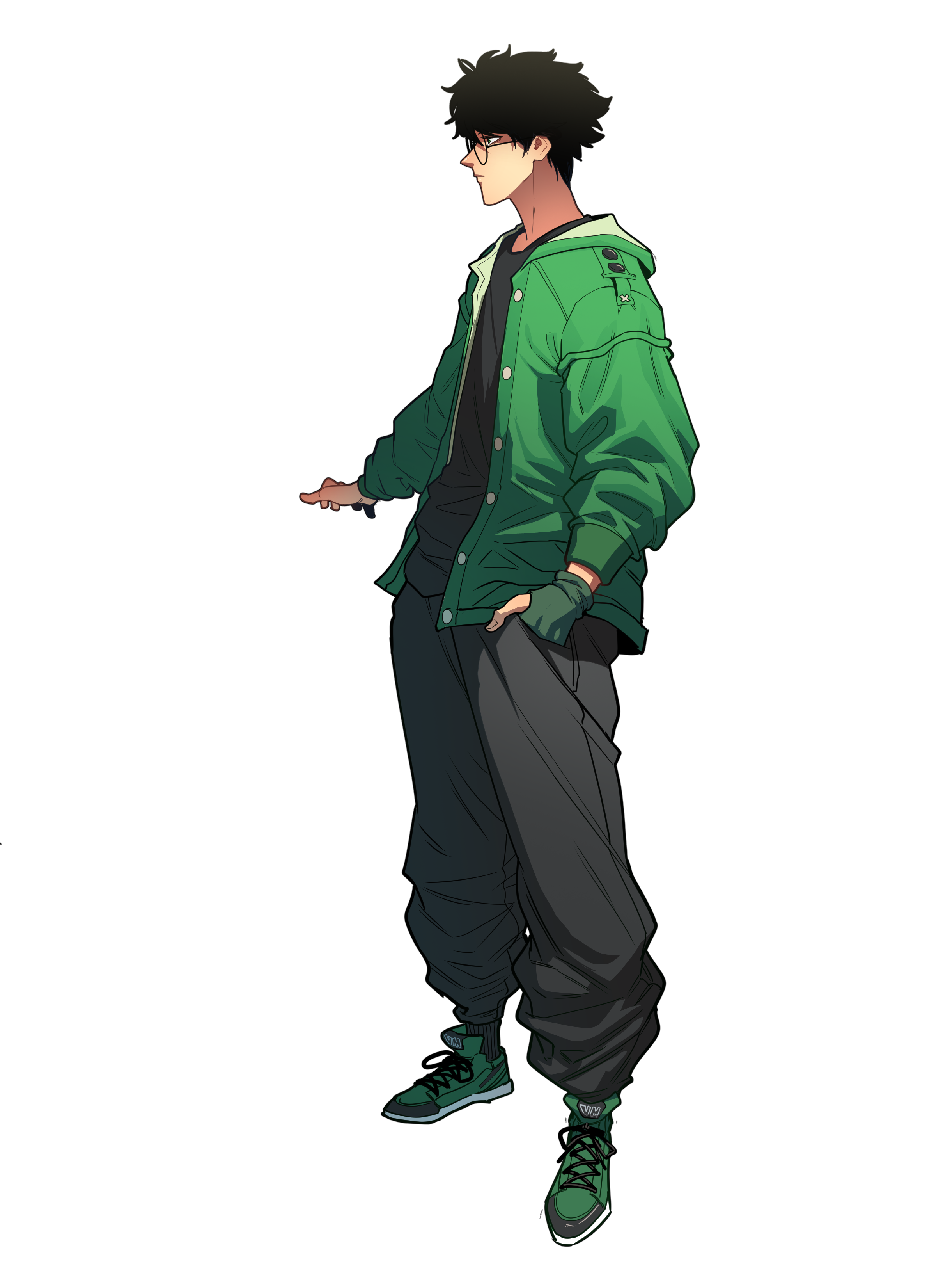 System Royale →
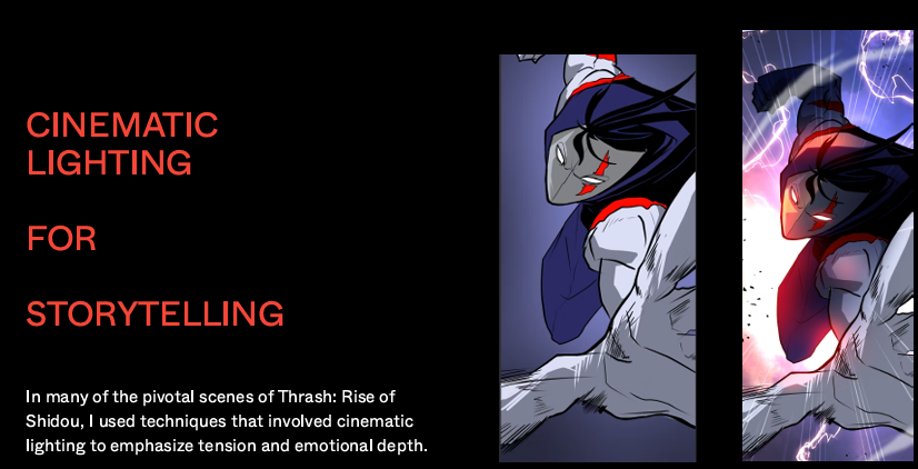
Cinematic Lighting & FX
Lighting and FX were treated as a final rendering pass rather than a storytelling tool, leaving technically correct scenes that read as emotionally flat.
50+ panels/week throughput standard
48-hour turnaround target
Global remote hiring funnel screened through a 4-artwork skills trial
Defined before/after transformation standard applied across every scene
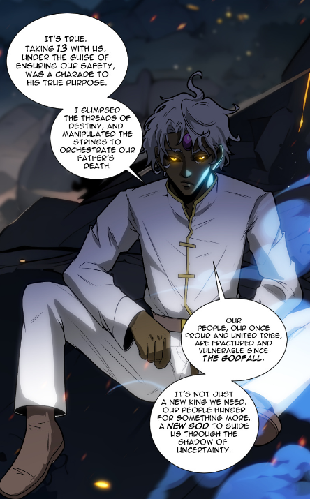 Before → After
{{ activeProjectTitle }}
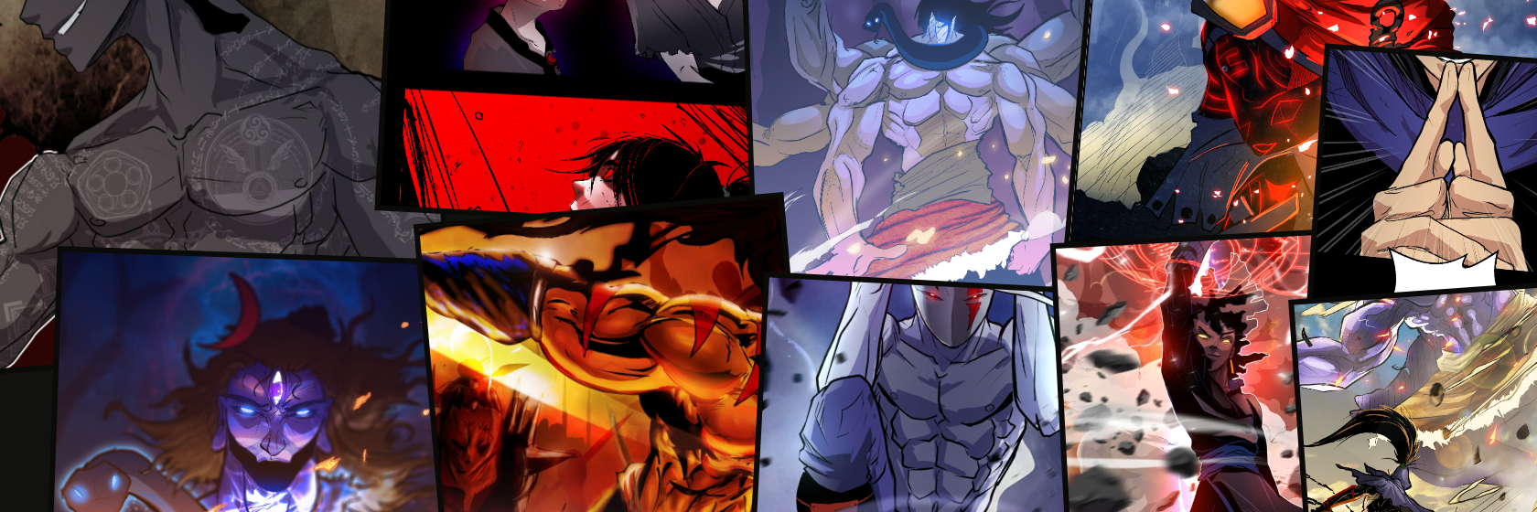
"A cinematic webtoon built to make every panel feel like a shot in motion."
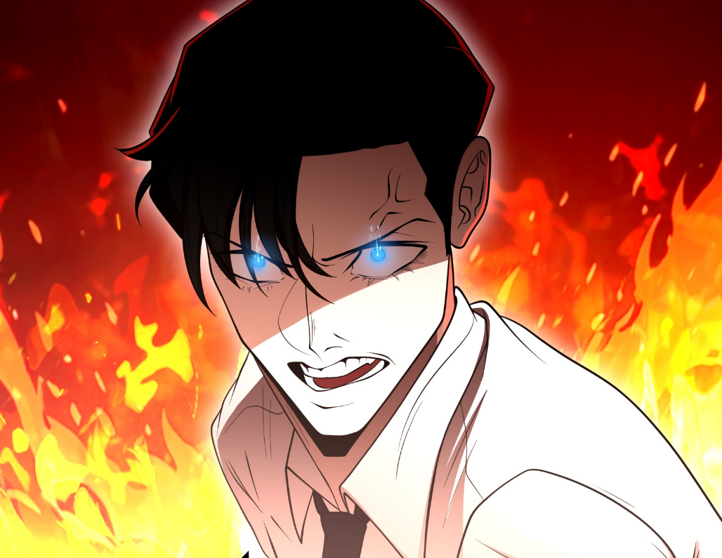
Building a cinematic webtoon through color, motion, and visual storytelling.
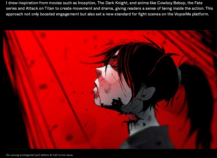
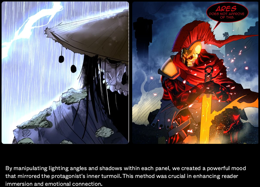
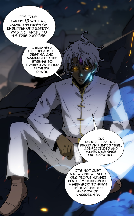
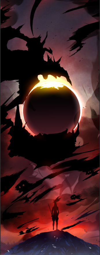
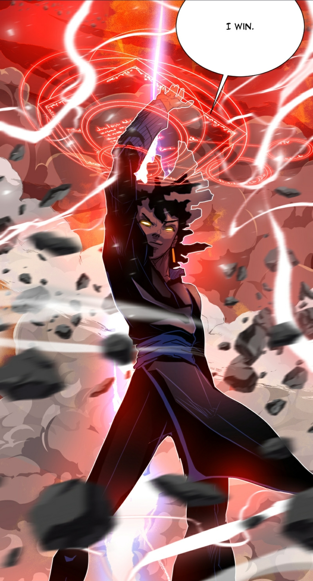
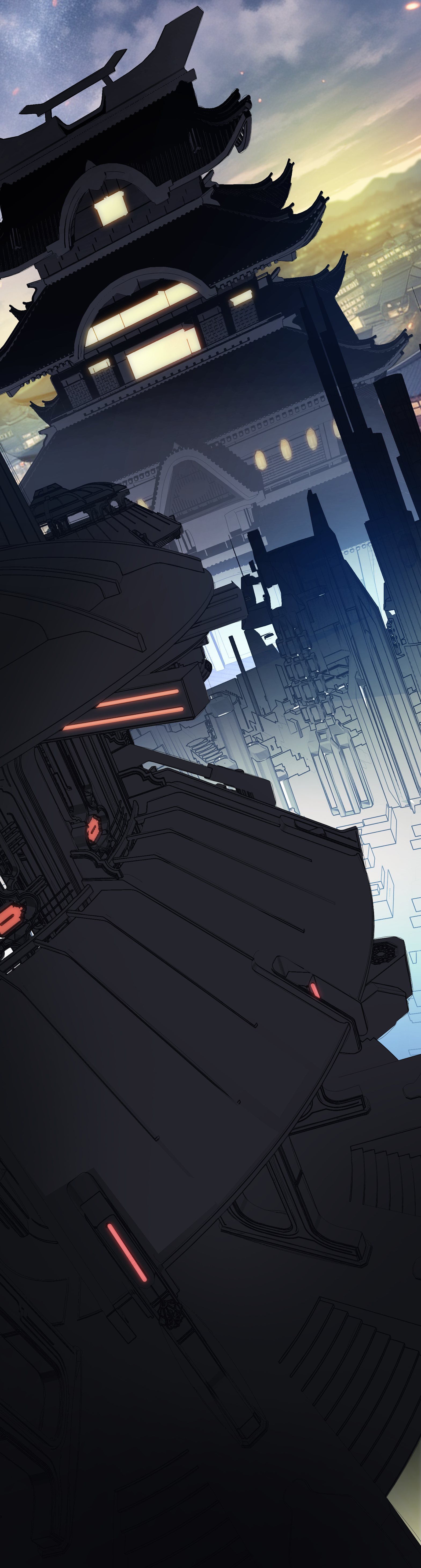
I designed the comic to feel less like a sequence of static illustrations and more like a film unfolding vertically. Dramatic lighting, dynamic camera angles, controlled color contrast, and action-driven composition give each scene a sense of movement, scale, and emotional intensity.
Hot colors; red, orange, and electric highlights signal danger, acceleration, and emotional escalation. Cooler blues and violets create separation and tension before impact. Shifting those relationships throughout a scene guides the reader's eye and controls how each story beat feels.
Art Fundamentals · Color and Lighting · Composition · Visual Storytelling · Worldbuilding
Enter the world of Thrash →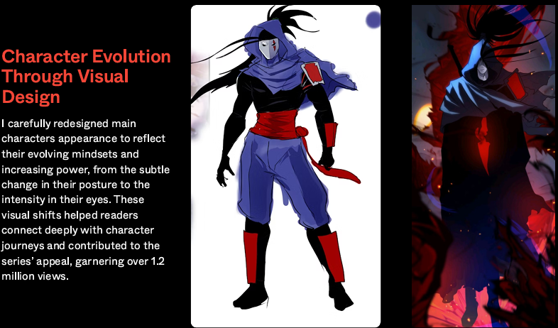
Character & Scene Development
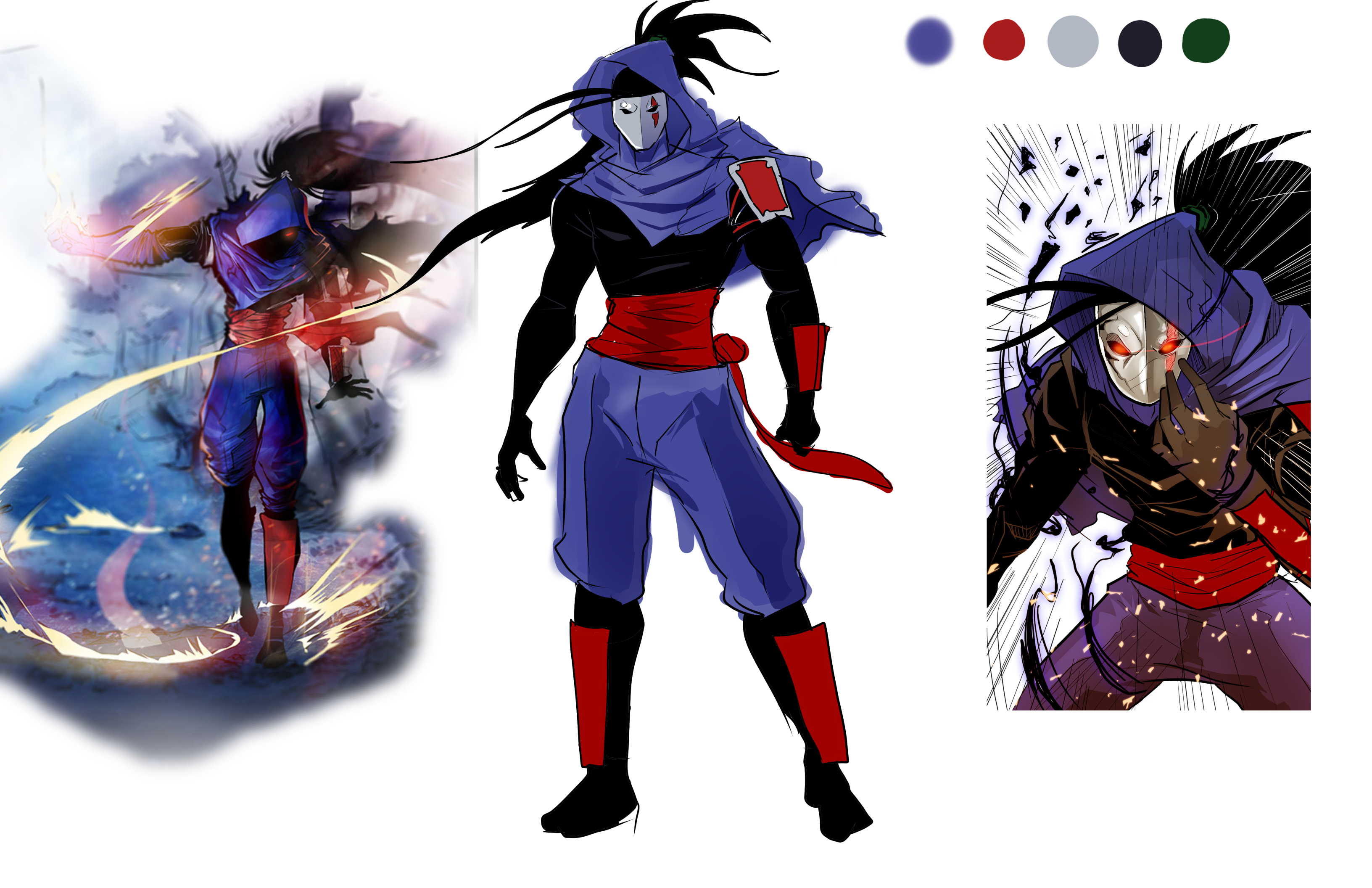
Directing an original IP from visual identity to audience growth.
Original Entertainment IP · Art Direction · Brand Strategy · AI Production Systems
Flagship
original IP
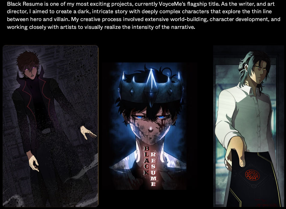
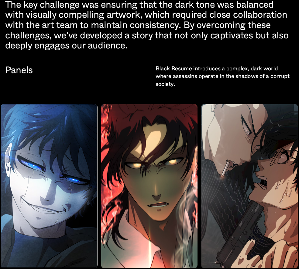
A flagship original IP on VoyceMe — recognizable brand and visual identity built for long-form production.
The Challenge
As Art Director, the goal was to create an original entertainment property with a visual identity strong enough to stand alongside premium streaming and gaming franchises. Instantly recognizable, and scalable enough for long-form production.
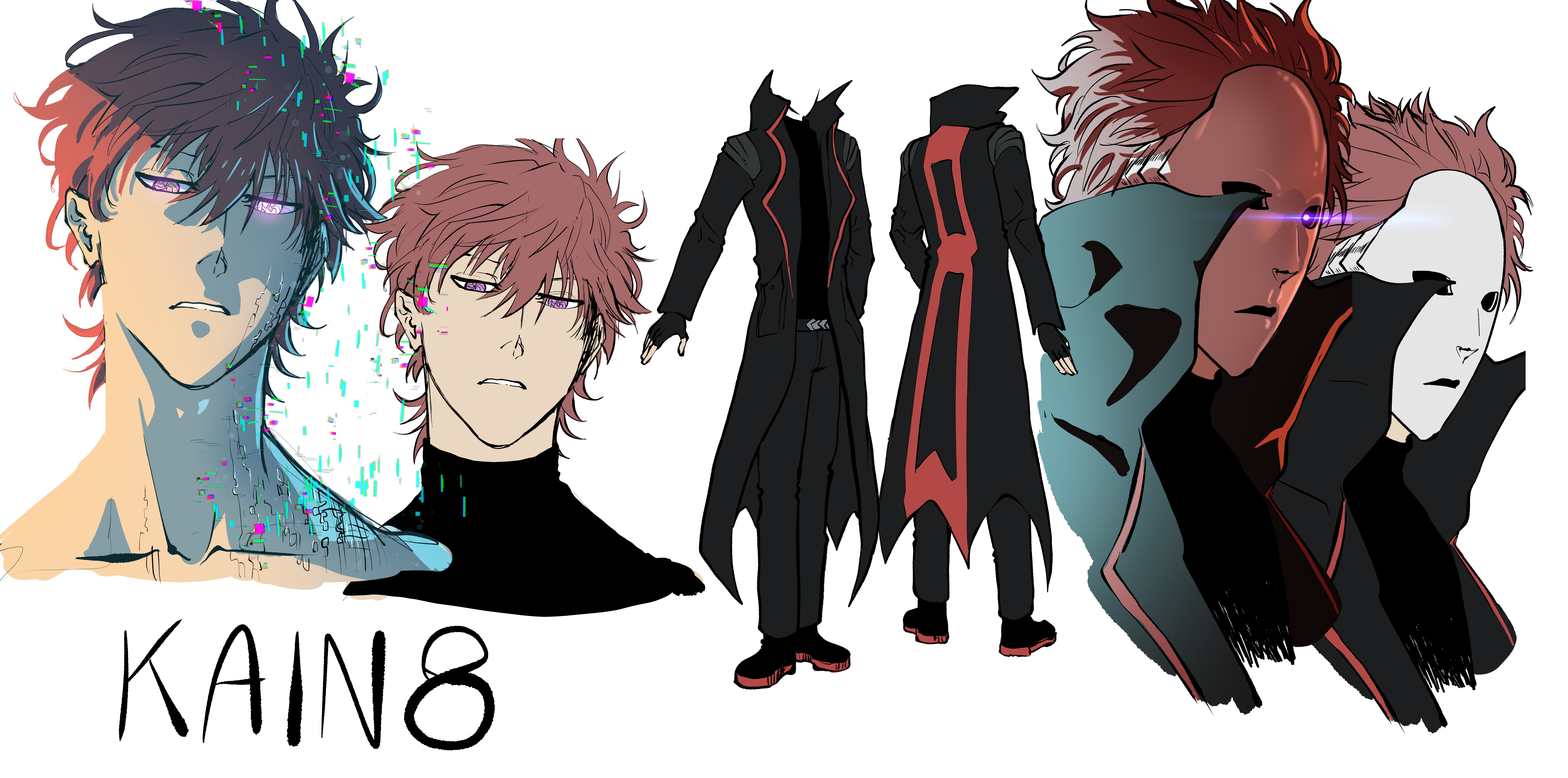
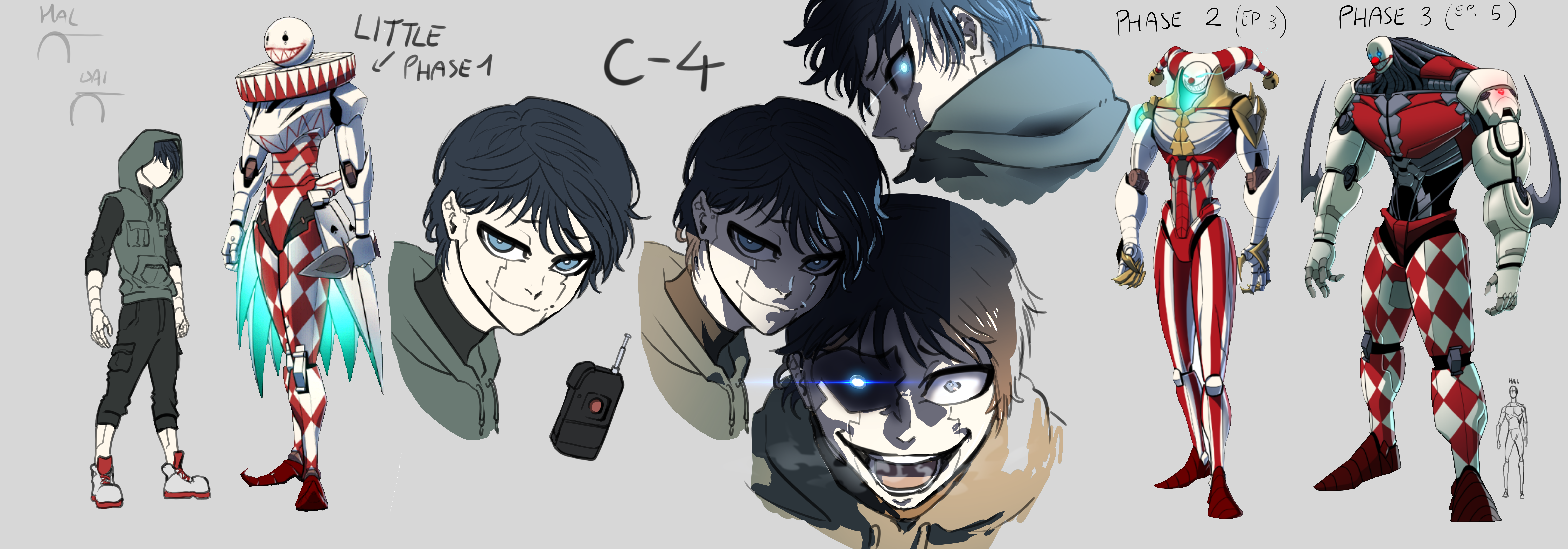
Artist-Led AI Production
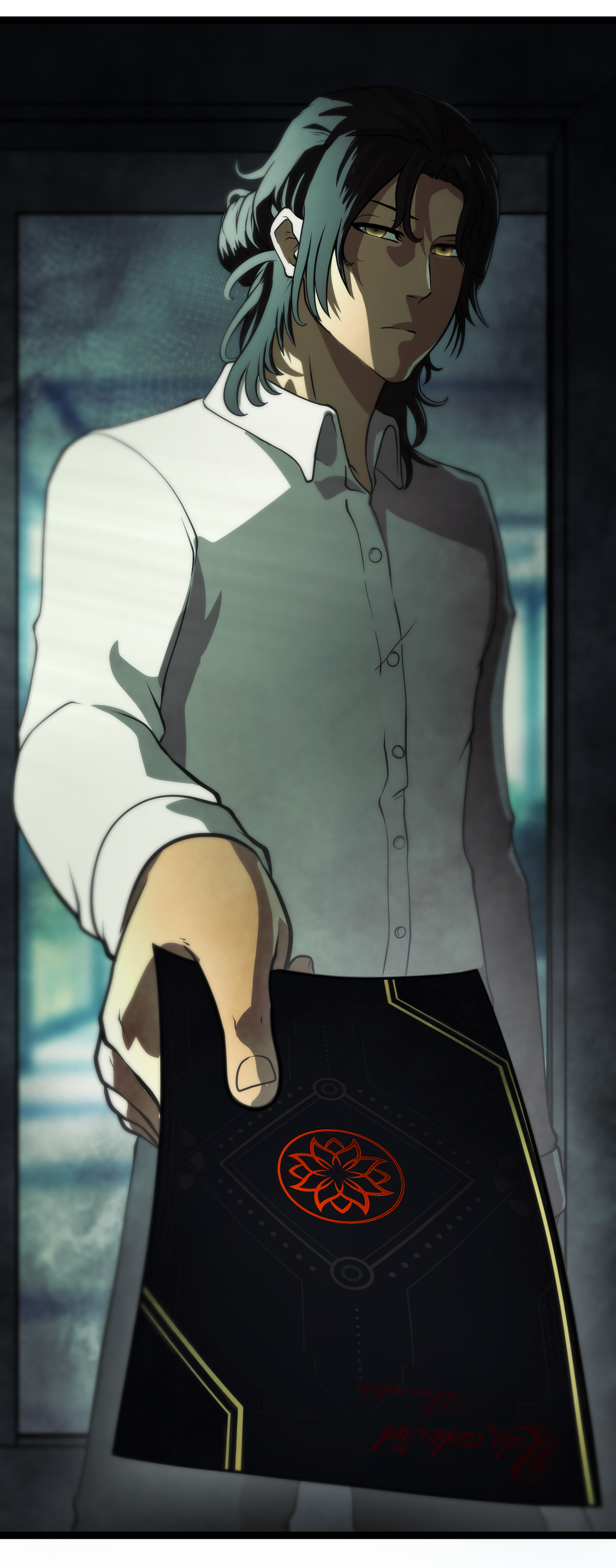
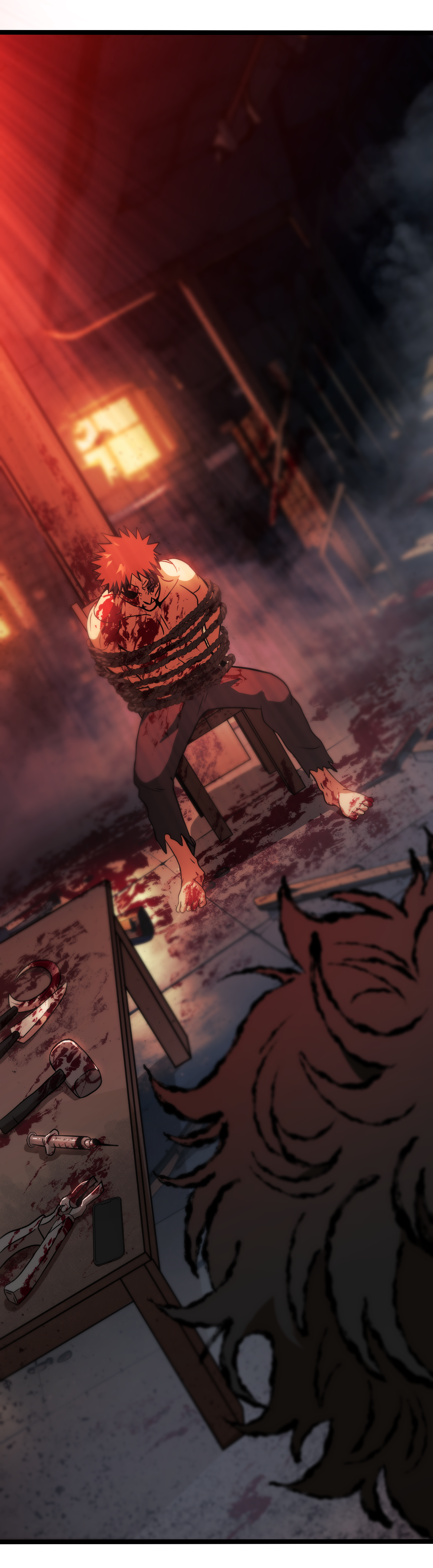
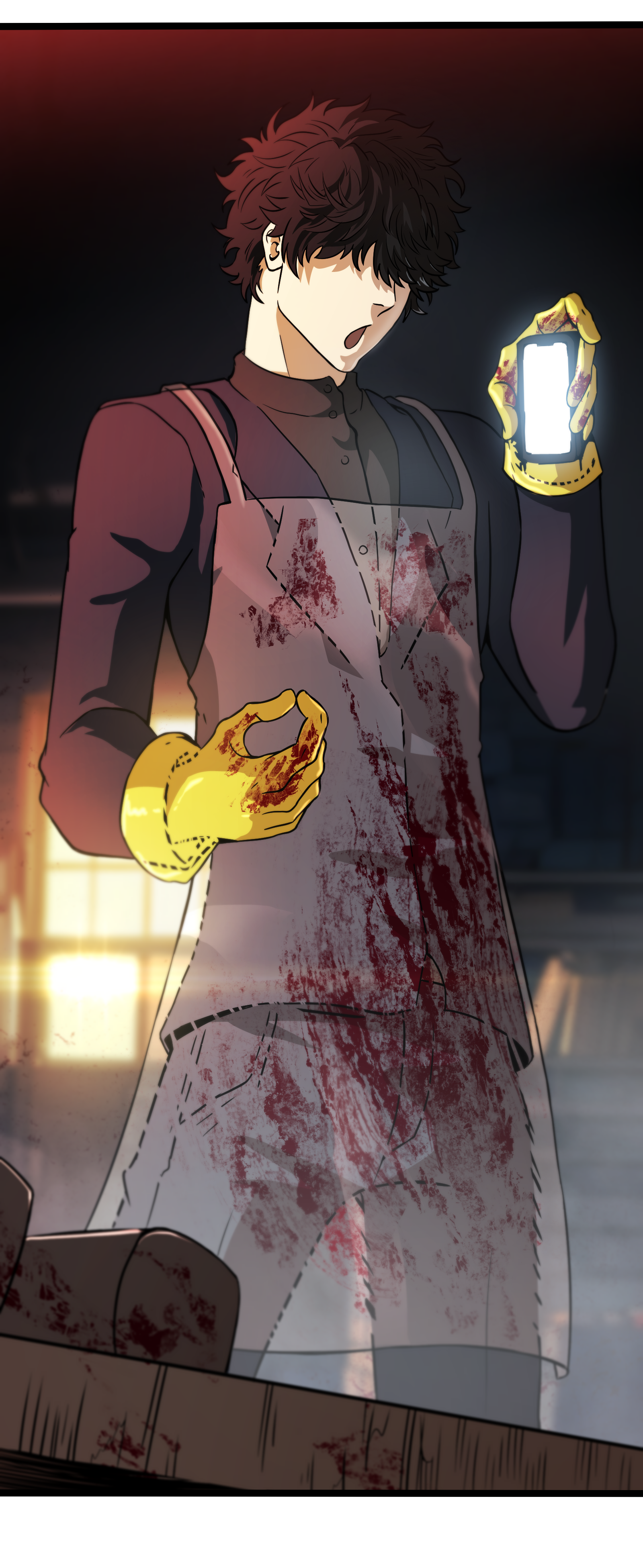
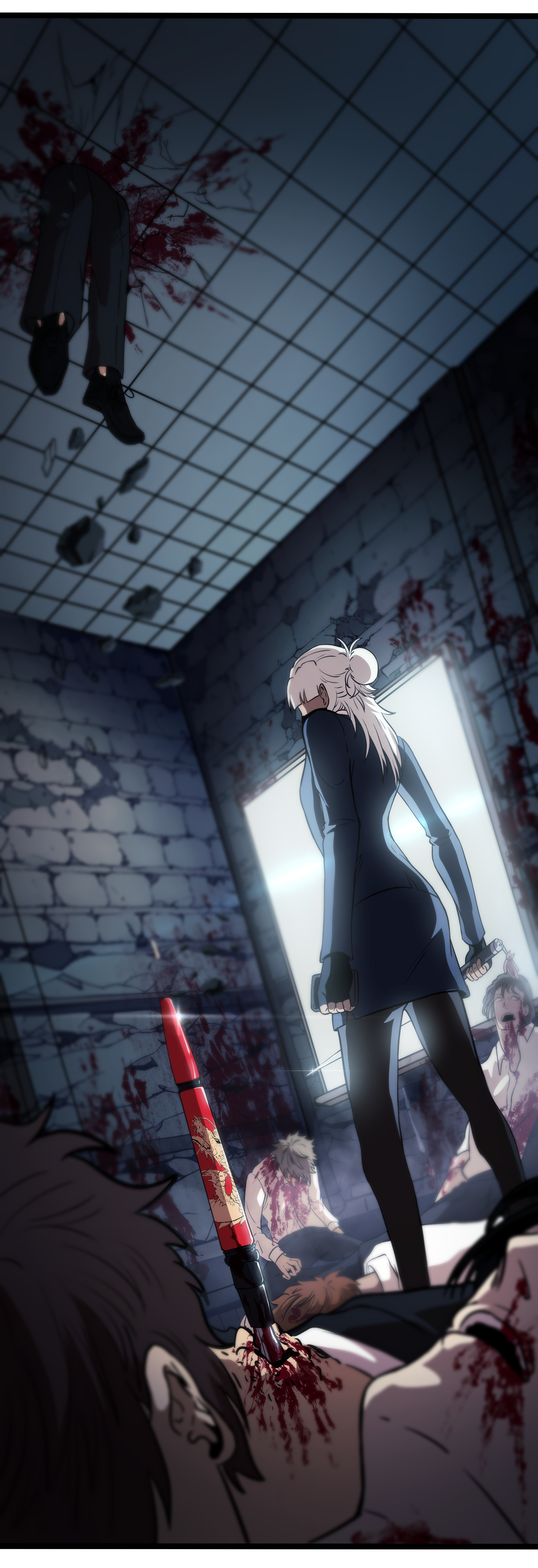
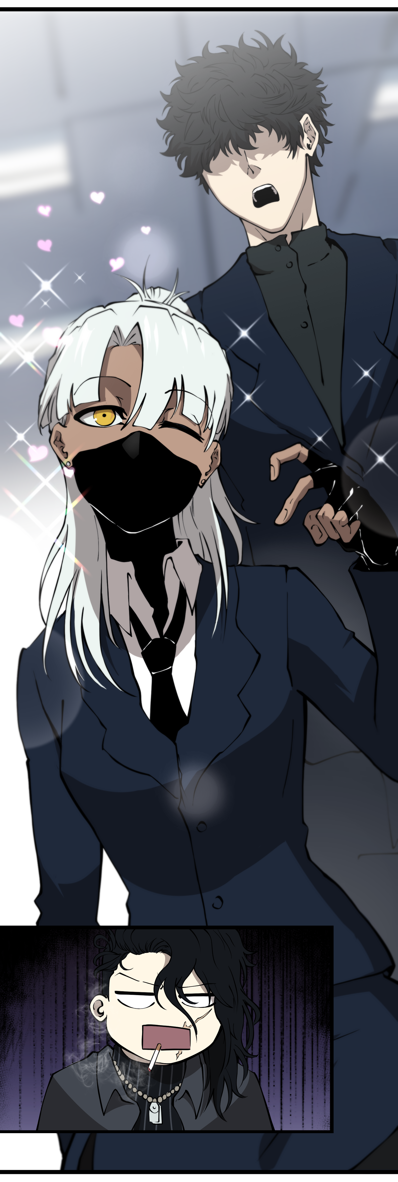
One of the biggest creative challenges wasn't aesthetic, it was production. As deadlines grew, I helped introduce AI-assisted workflows that accelerated repetitive work without replacing artists. Instead of generating finished artwork, we built a pipeline where artists remained the creative decision-makers: AI supported environment ideation, background development, asset generation, color exploration, reference creation, and production acceleration. Artists created the training material, reviewed every output, and maintained final artistic quality throughout. An ethical, artist-centered philosophy from the start.
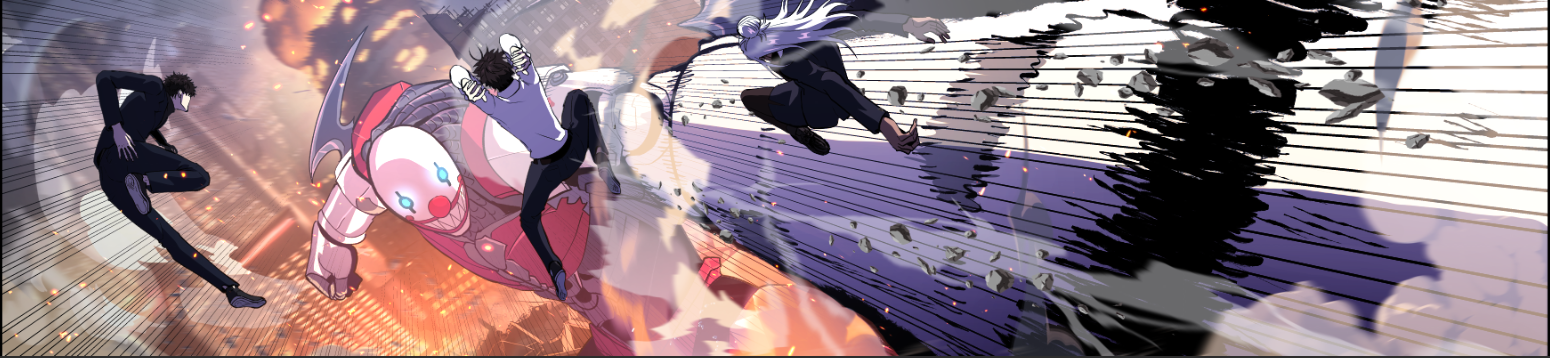
Impact
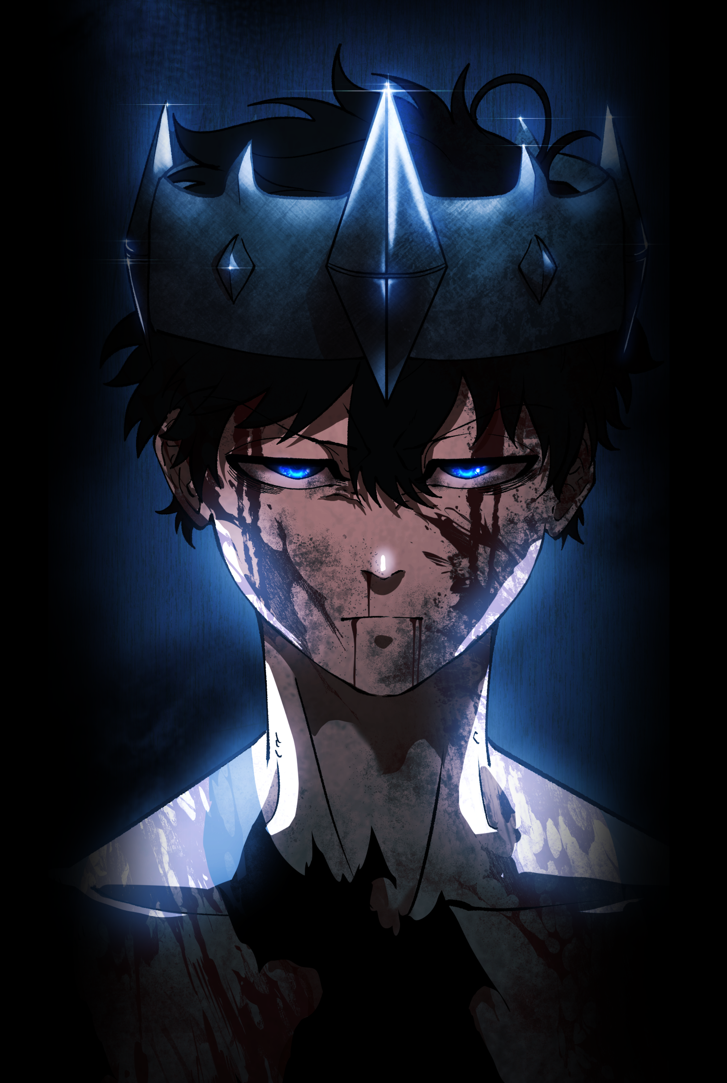
Black Resume became one of VoyceMe's flagship original IP titles. More importantly, it proved that AI-assisted production could strengthen the artists behind the work, not replace them.
View the Black Resume case study →IP Development
Helped shape the property's tone, identity, visual language, and audience-facing presentation.
Art Direction
Created a clear visual target, guided contributors, and maintained consistency across a wide range of assets.
Human-Led AI Pipeline
Used AI-assisted backgrounds and effects from VoyceMe's internal generation tool as a starting point for exploration, while artists retained authorship, refinement, judgment, and final execution on every panel.
Brand Growth
Helped develop a recognizable visual identity for a flagship original IP on VoyceMe.
Art directing for the Zokio NFT universe.
Character Art Direction · Illustration Review · Zokio NFT Collection
The Brief
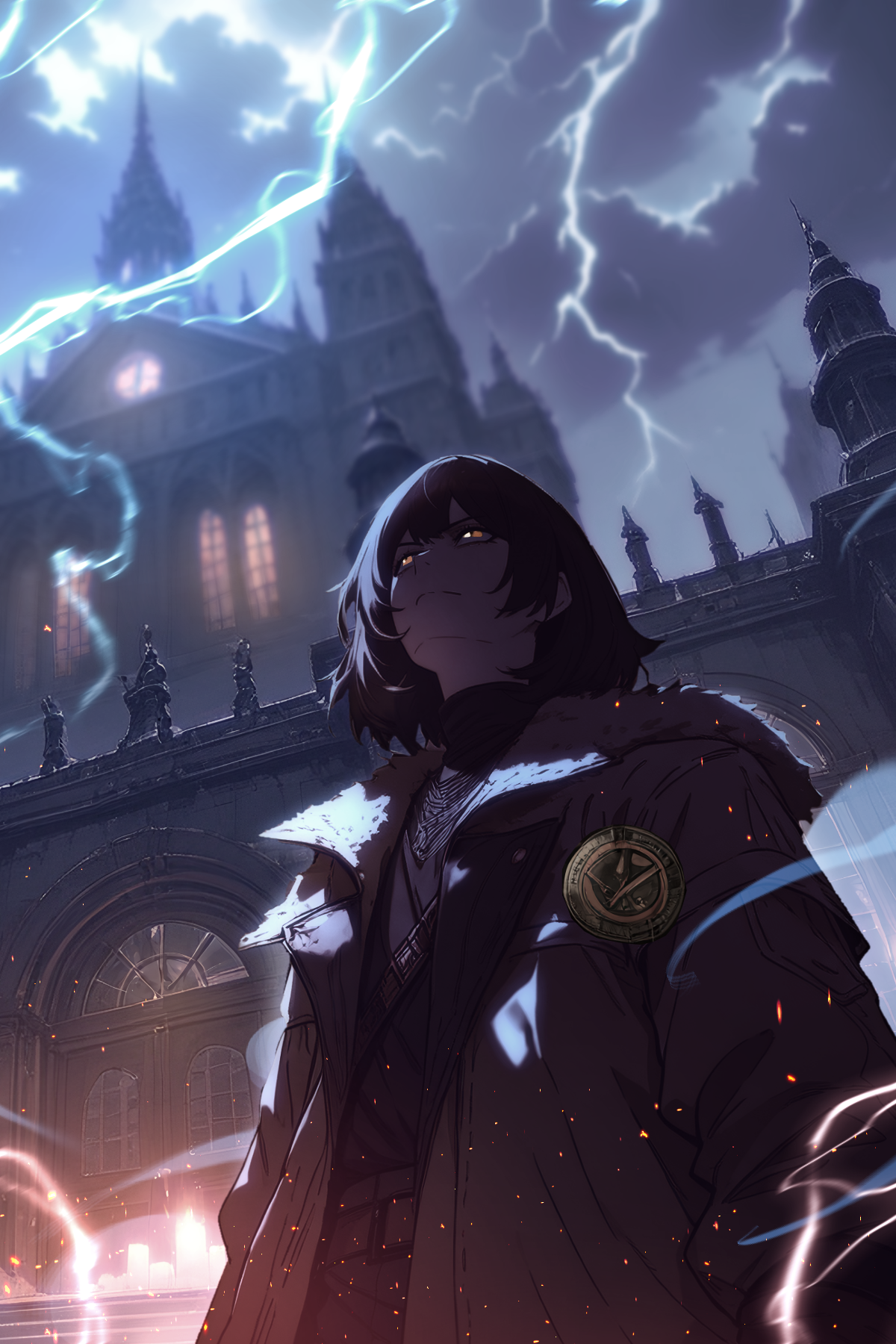
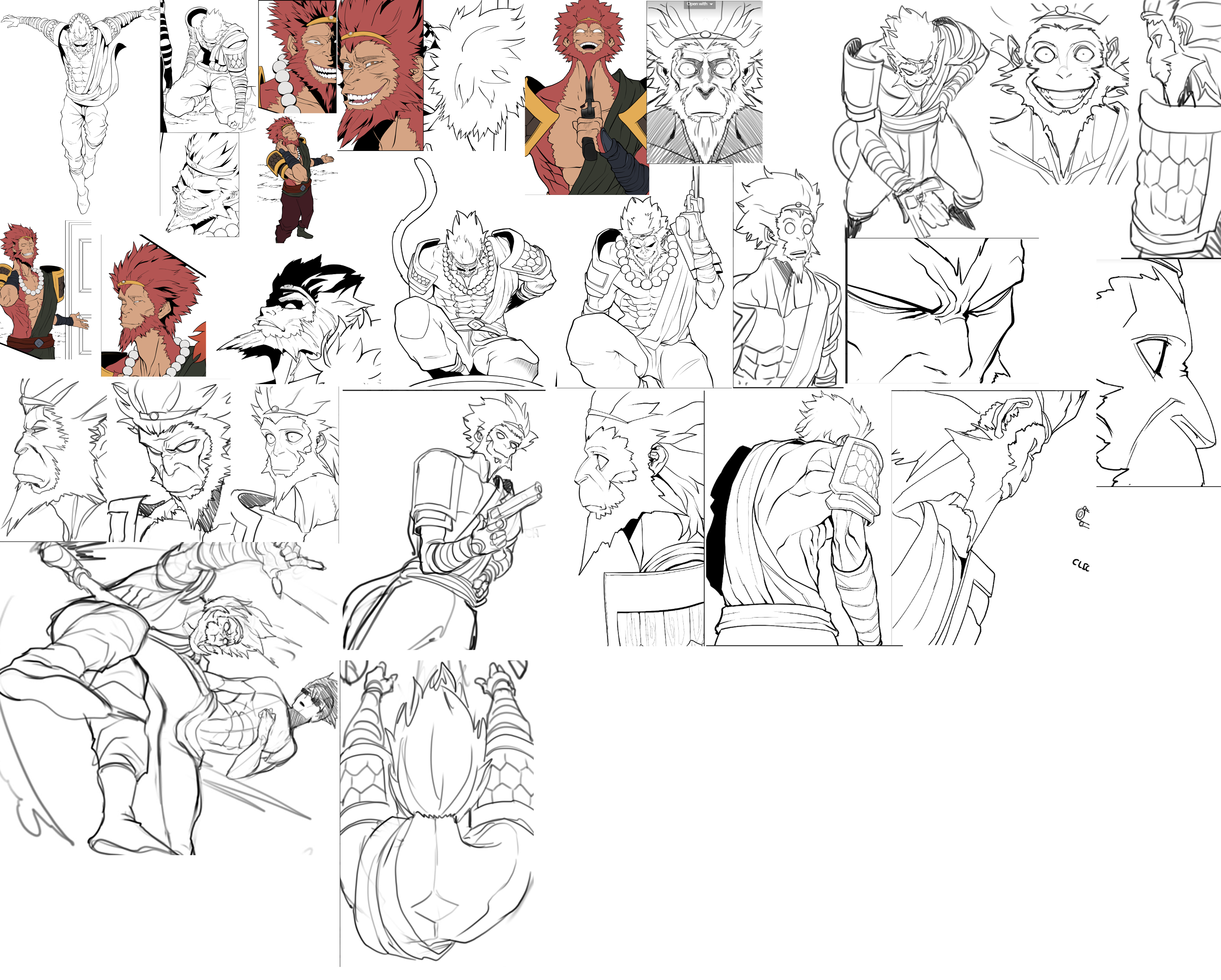
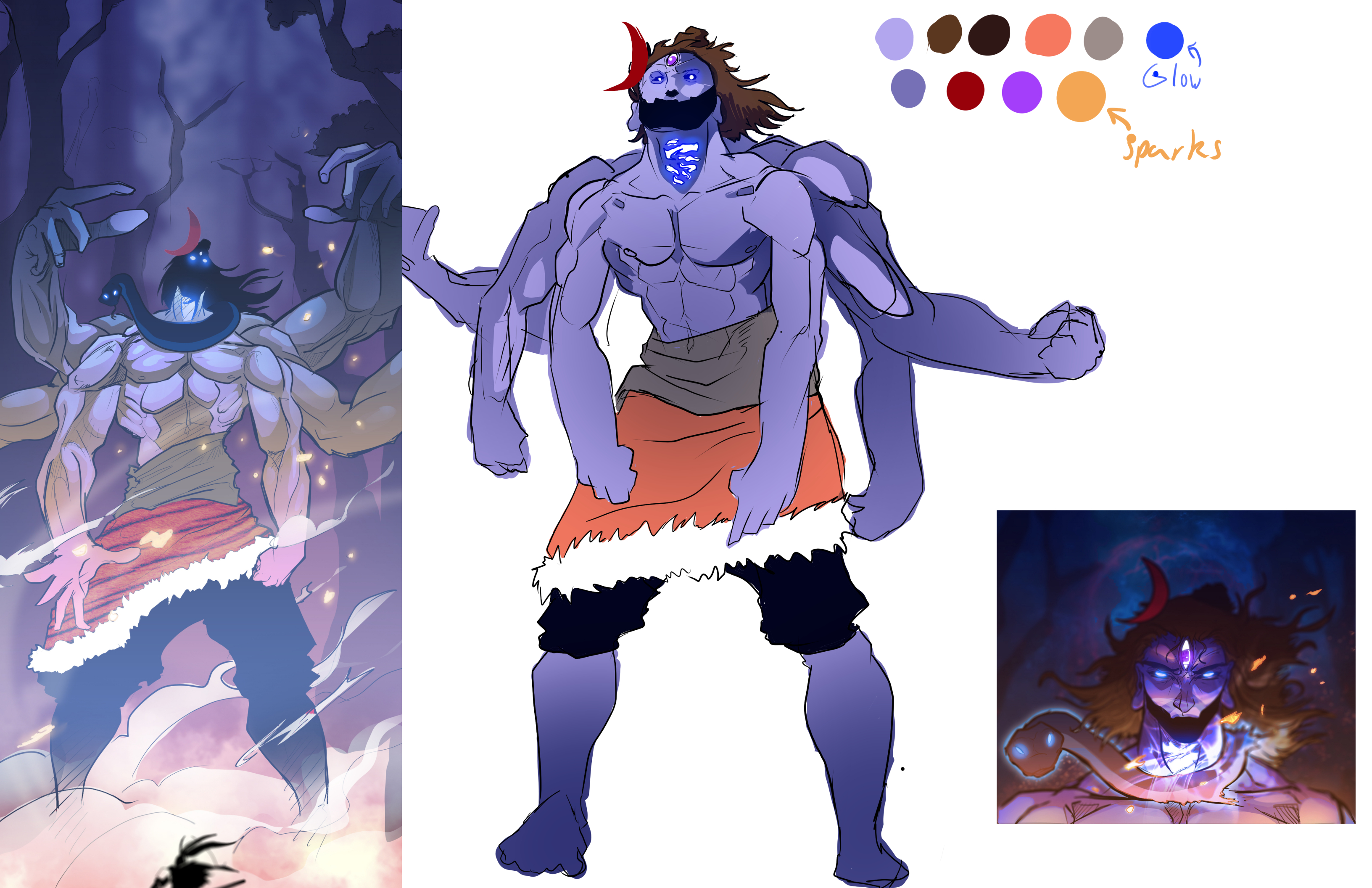
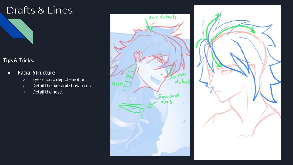
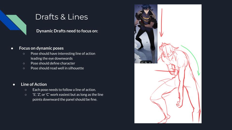
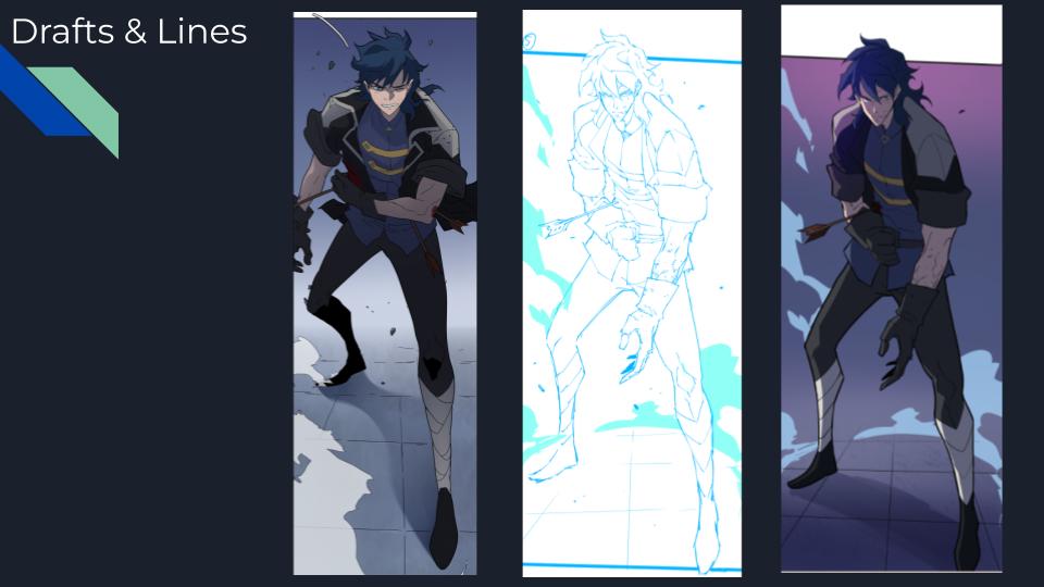
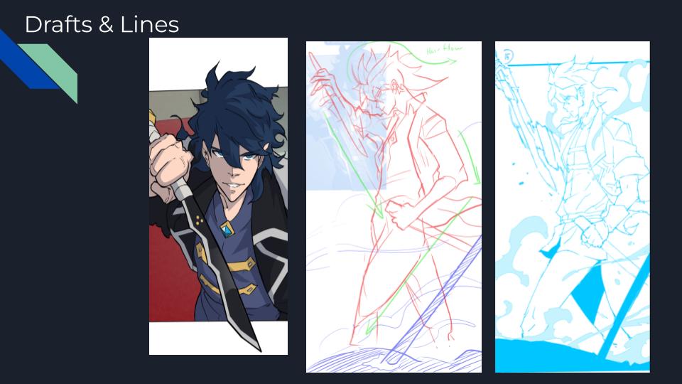
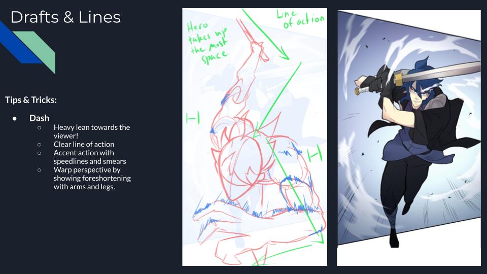
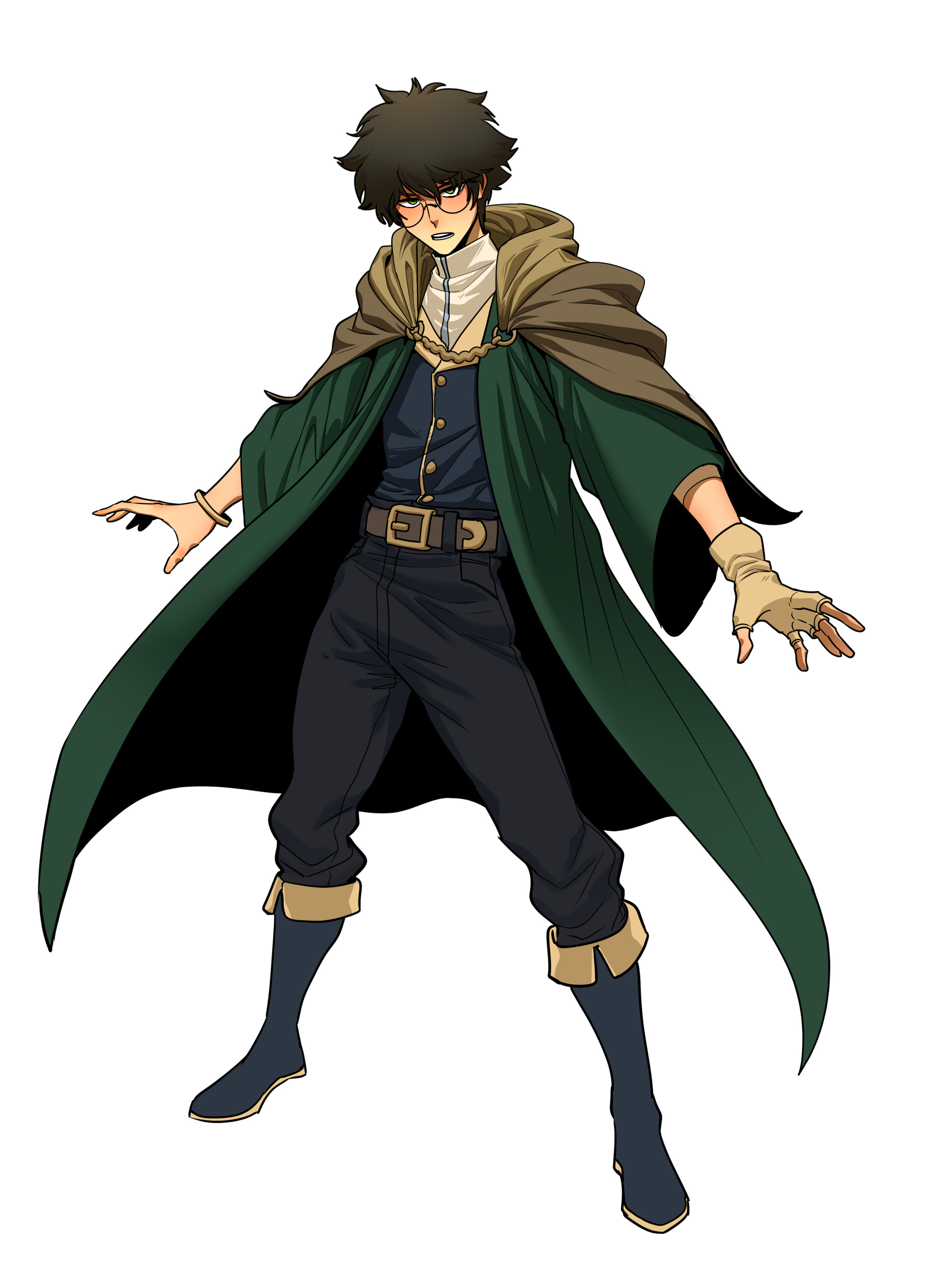
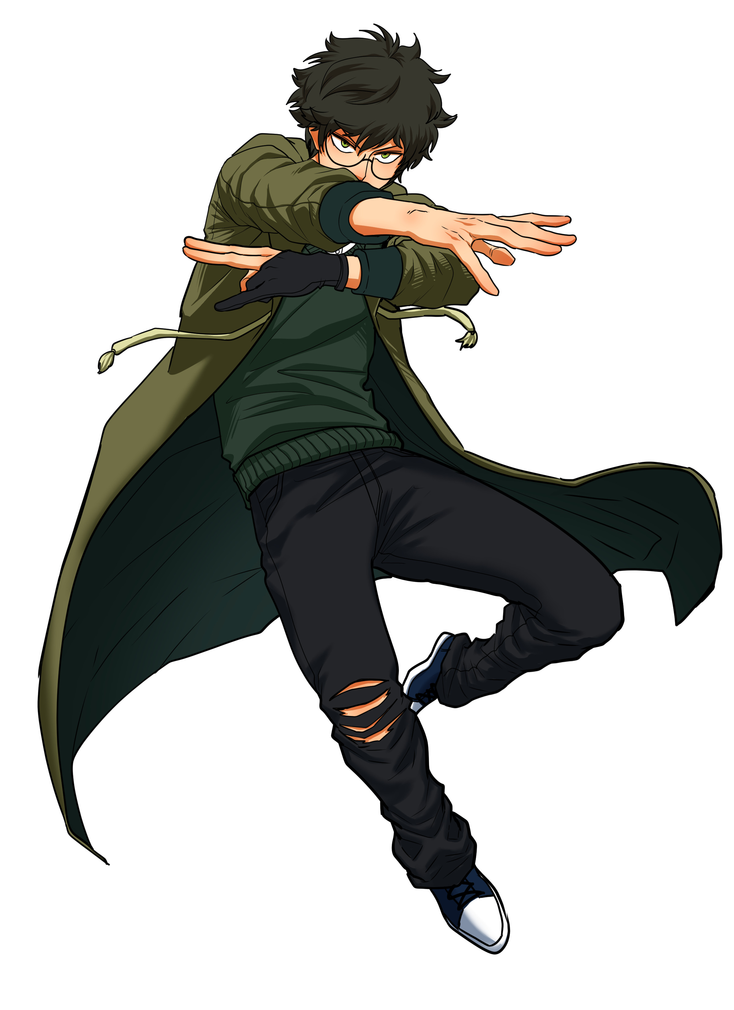
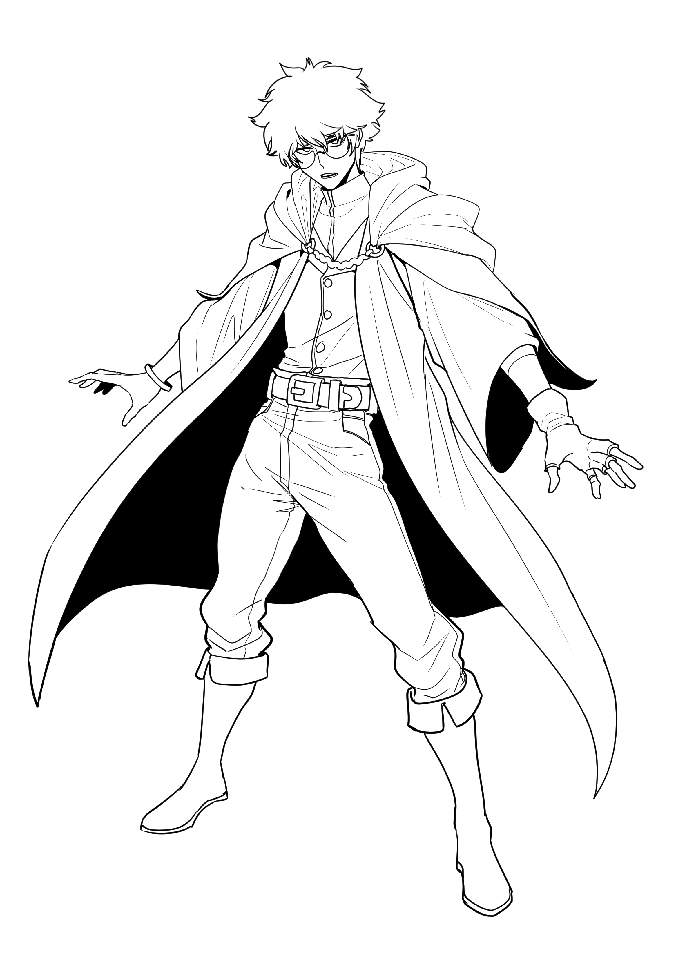
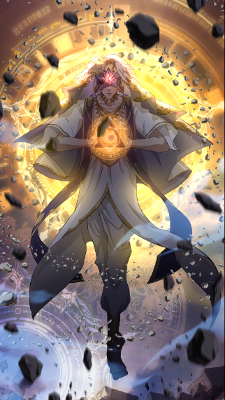
I art directed Mage of Blades for a NFT project. The piece, through several review passes with the illustrator, focused on pose construction, line of action, and final compositing rather than redrawing the character myself.
The goal throughout was to push every draft toward a stronger silhouette and a more legible sense of motion before any color or effects work began.
Red Lining: Drafts & Line of Action
Most of the Direction focused on facial structure; eyes that carry emotion, roots in the hairline, clearly defined features, and on posing: every draft was pushed toward a single readable line of action (an S, Z, or C curve pointing down through the figure) so the pose stays legible in silhouette and leads the eye through the panel.
Compositing — Enhancing Dynamics
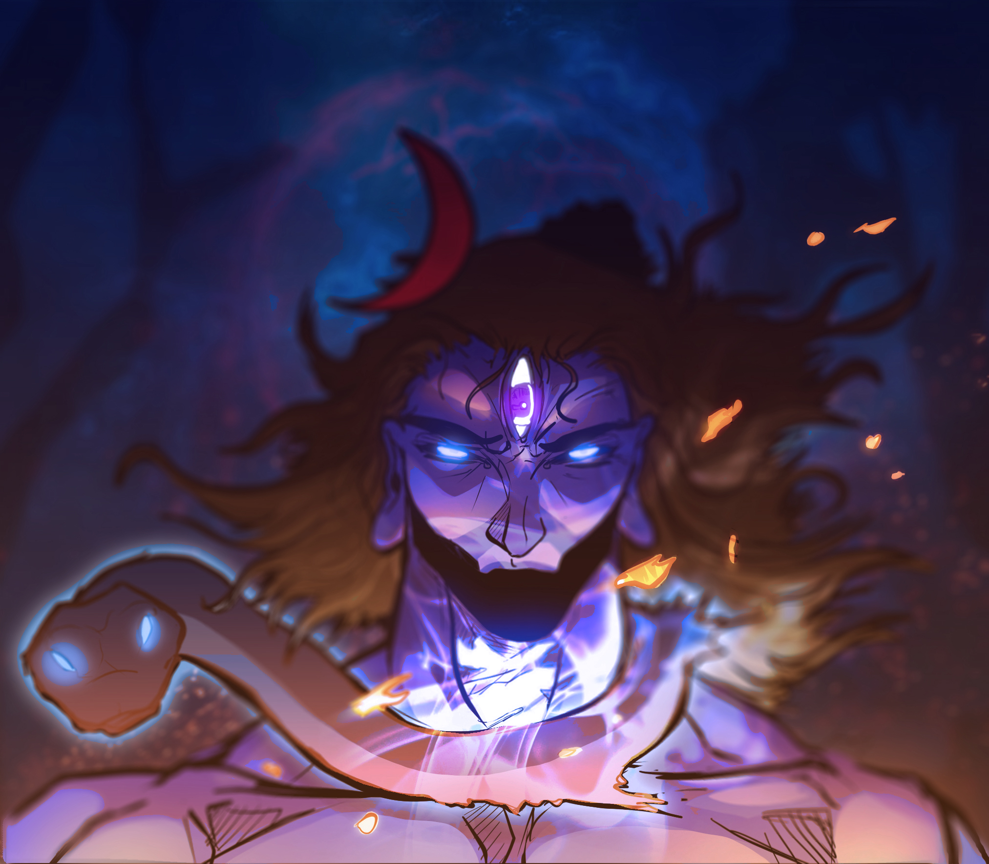
The final review pass sat with compositors rather than illustrators. The same fight choreography was pushed through multiple lighting and effects treatments and judged side by side against a consistent set of metrics but essentially, how the panel feels to look at, not just whether it's technically correct.
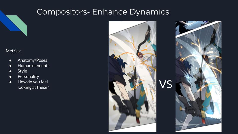
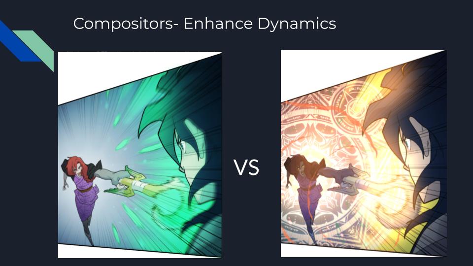
"A pose only reads as heroic once the line of action, the silhouette, and the light are all pulling in the same direction."
View the Zokio NFT collection →Building a full cast at scale with an artist-led AI pipeline.
Character Design · Ensemble Cast · StoryTech Artist Initiative
Use of AI — an Ethical Creation Tool
Rather than adopt a public AI model trained on scraped artwork without consent, VoyceMe built its own Creation Tool trained only on material its own artists opted to contribute. Artists created the training material and reviewed every output, so the tool never replaced their judgment. It removed the hours of repetitive setup work standing between a concept and a finished panel.
The training material came from the artists themselves. On this project that meant the character turnarounds, pose sets, and finished art our team had already produced were what taught the tool the house style. Artists supplied the reference the model learned from, so anything it generated came back in a visual language they had authored, which is also why an artist could correct it quickly instead of fighting it.
In practice, that meant the tool handled background generation and an asset library of reusable environment pieces, freeing artists to spend their time on characters. Every image still passed through an artist for a final human touch before it shipped.
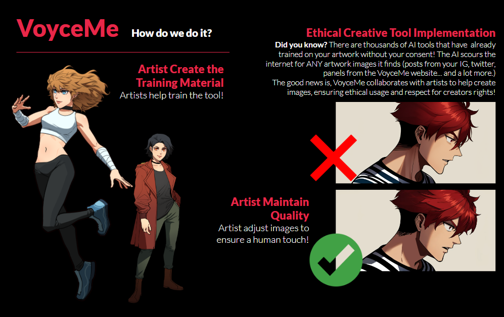
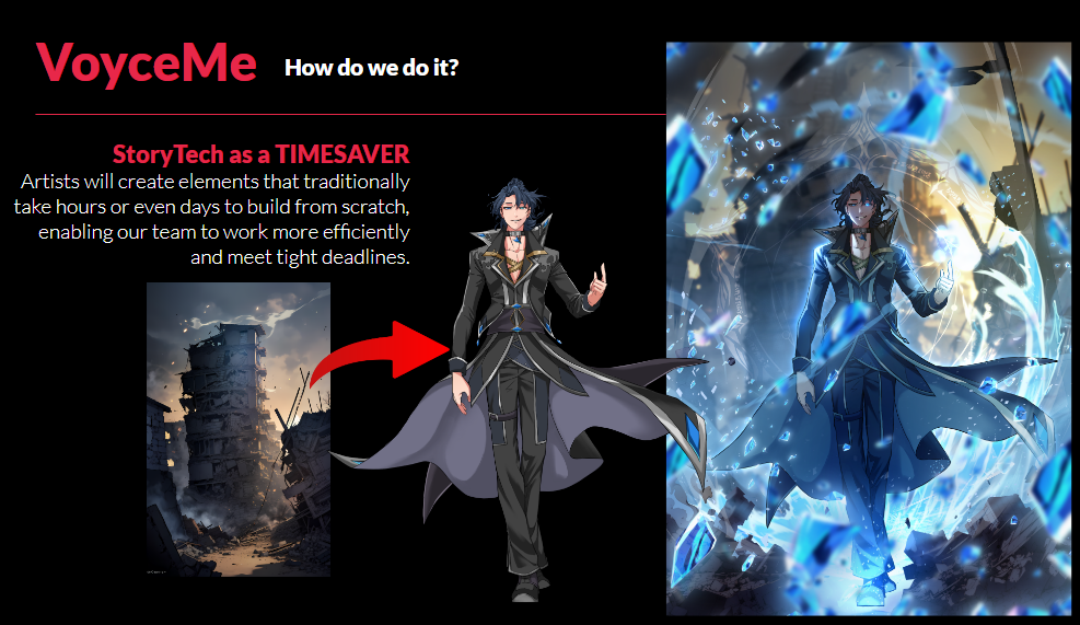
Artists Create the Training Material
The tool was trained on VoyceMe's own artists' work, with their consent, not scraped from the open internet.
Background Creation, so Artists Focus on Characters
An asset library of backgrounds and environments let artists build dynamic scenes quickly and spend their time on the cast instead.
Artists Maintain Quality
Every output was adjusted and approved by an artist before it shipped, keeping a human touch on every panel.
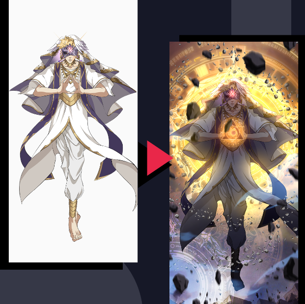
The StoryTech Artist
The left side is the drawn work: a hand-illustrated character on a clean background. The right side is the finished composite; that same drawing integrated with an AI-generated background and effects built in Clip Studio Paint. Magic circles, debris, glow, and atmospheric passes were layered around the figure, then light direction and color temperature were matched between character and environment so the two read as one image.
The role borrows directly from animation and VFX, where a compositor is the person who takes separately produced elements (characters, effects, backgrounds.) and merges them into a single believable frame.
Applied to webcomics, that becomes the StoryTech Artist: an artist who works across foreground, character, and background layers, deciding what gets drawn, what gets generated, what gets pulled from the asset library, and how all of it is unified into a finished piece. Compositing is the skill that makes the pipeline coherent instead of a pile of mismatched parts.
The Brief
This webtoon project I directed (System Royale) needed a large, visually distinct cast introduced quickly, without letting quality slip as the roster grew. So each character needed clean turnarounds, a readable silhouette, and enough personality to stand apart in group scenes. With tight deadlines around the corner we turned to AI to help with some of the heavy lifting.
To hit that volume on schedule, character and background work moved through VoyceMe's internal Creation Tool: an AI pipeline trained and supervised by artists rather than one that generates finished art on its own.
Solving it at that scale is what produced a new role on the team. Splitting a page into drawn characters, generated environments, and effects passes meant someone had to own how those layers came back together so I defined the StoryTech Artist, a compositing-first position modeled on animation and VFX pipelines rather than on traditional single-artist illustration.
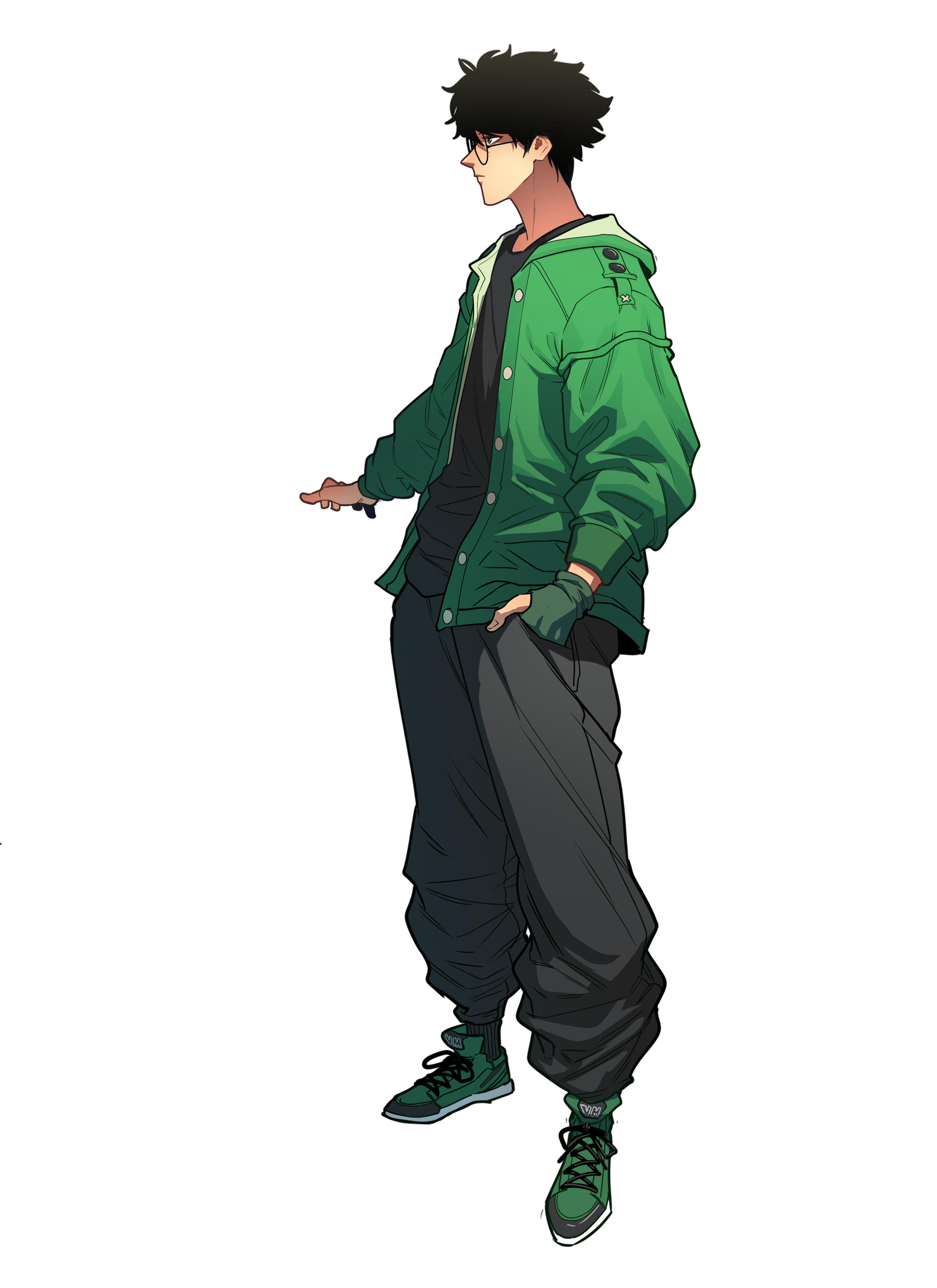
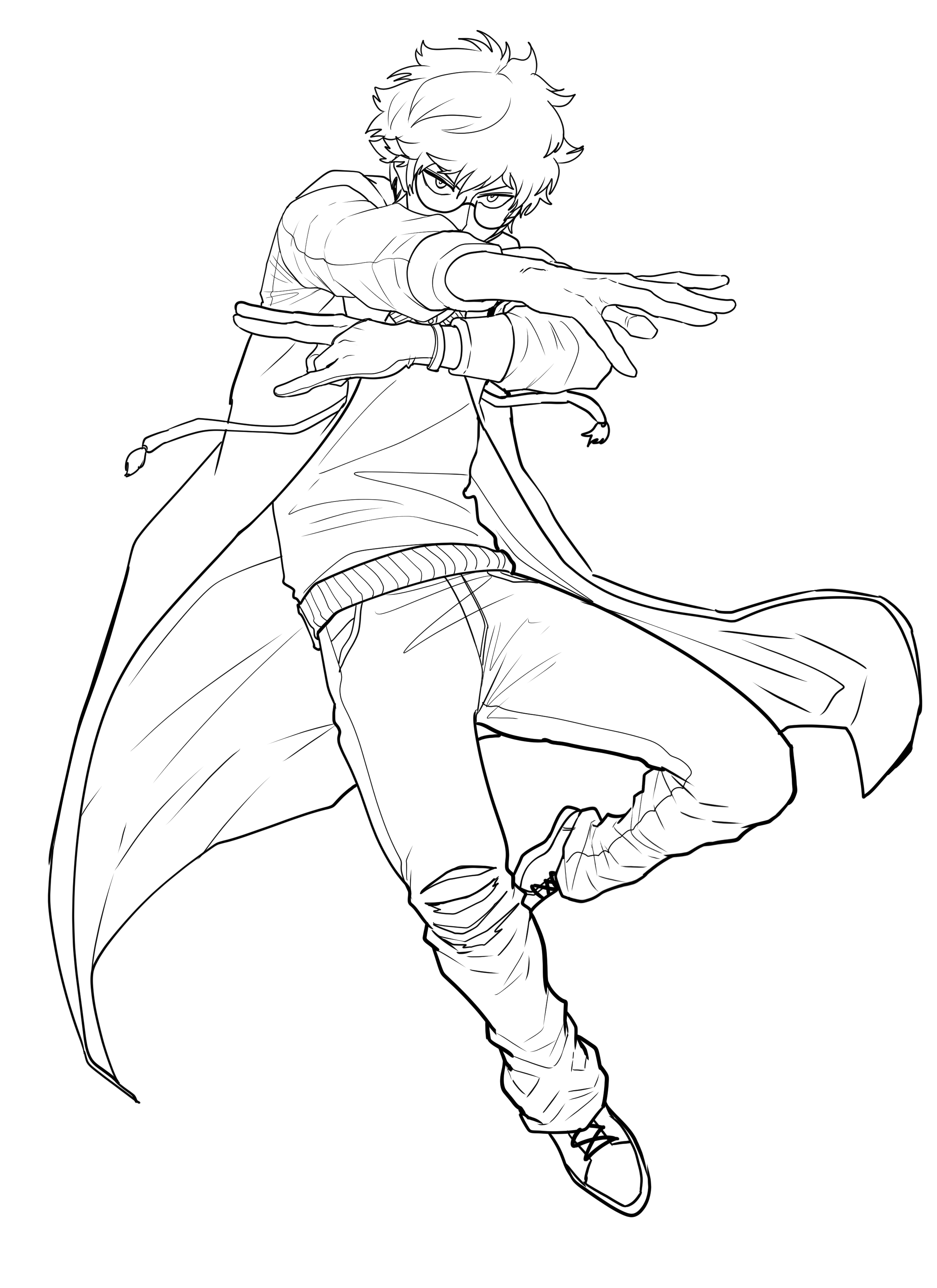
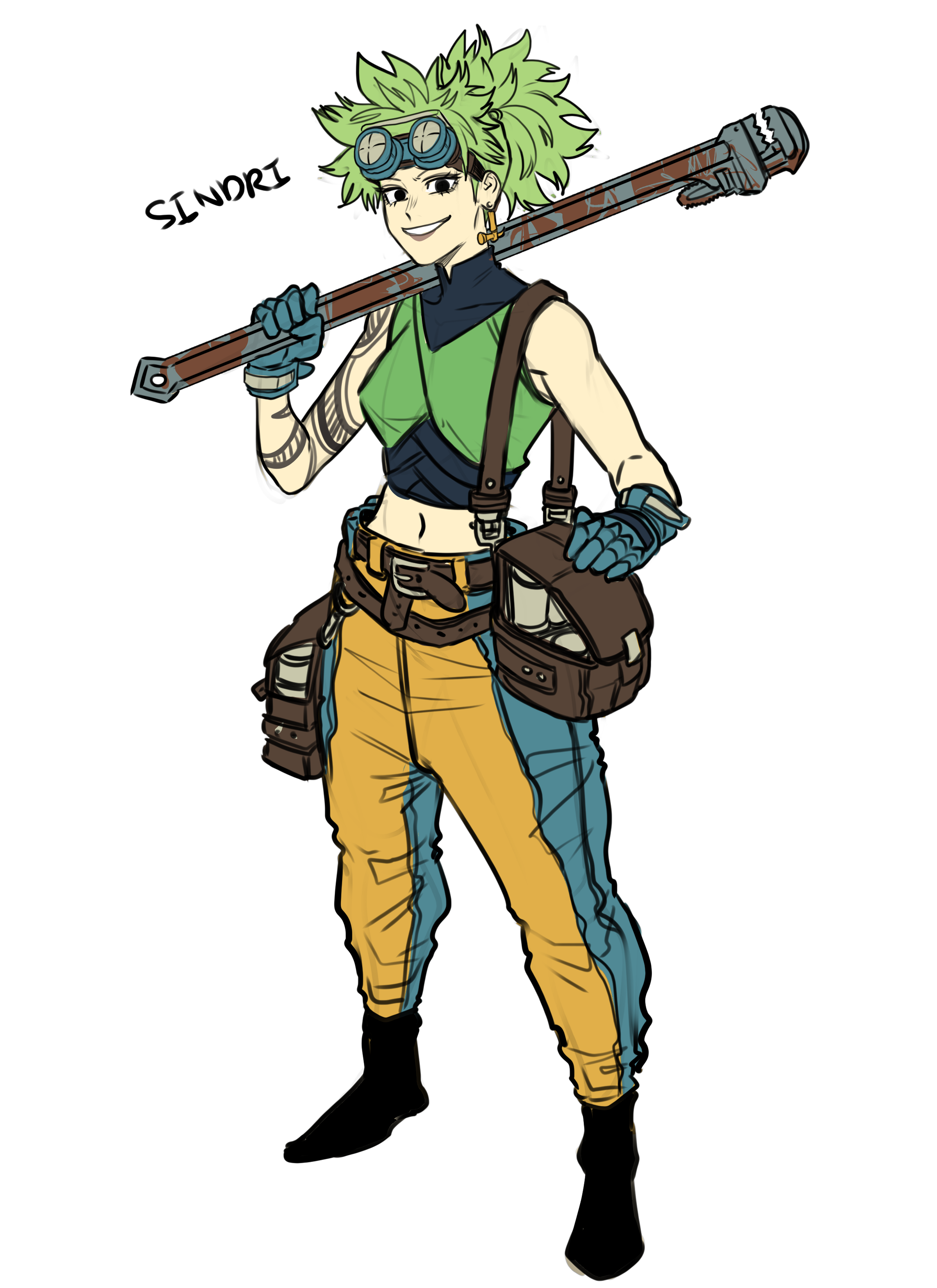
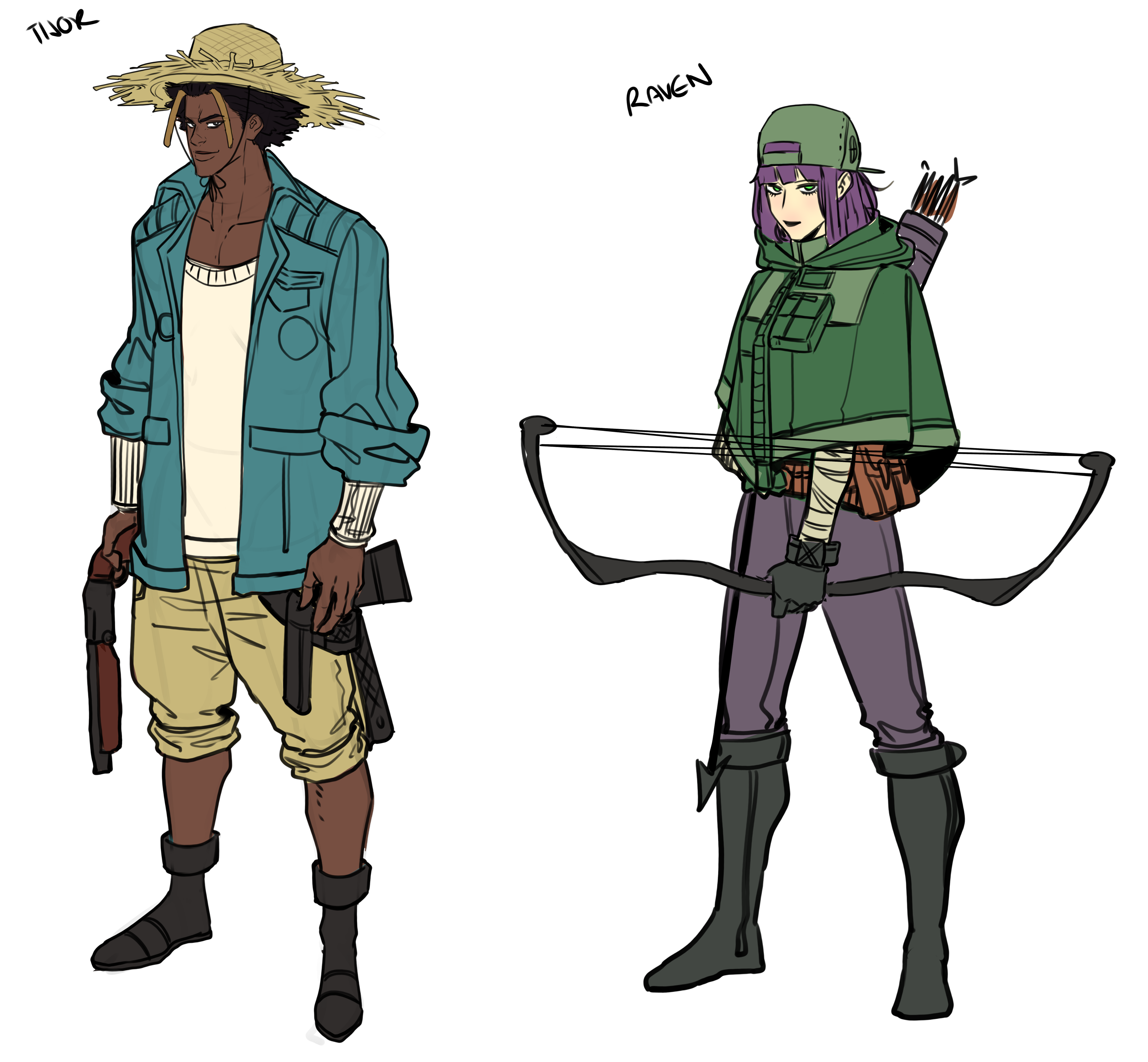
Cast & Turnarounds
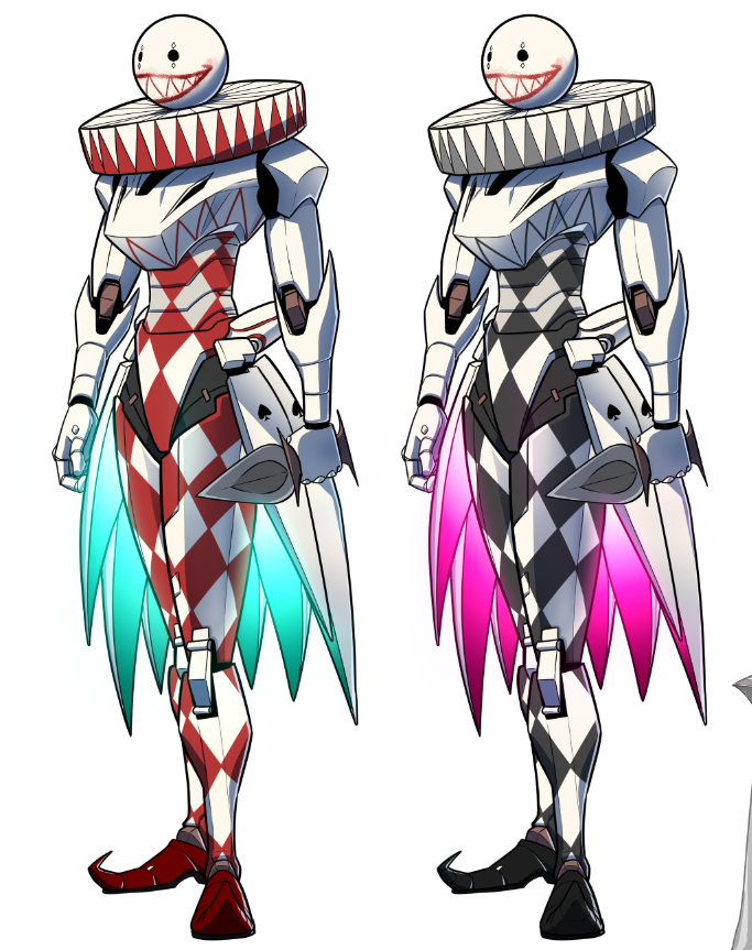
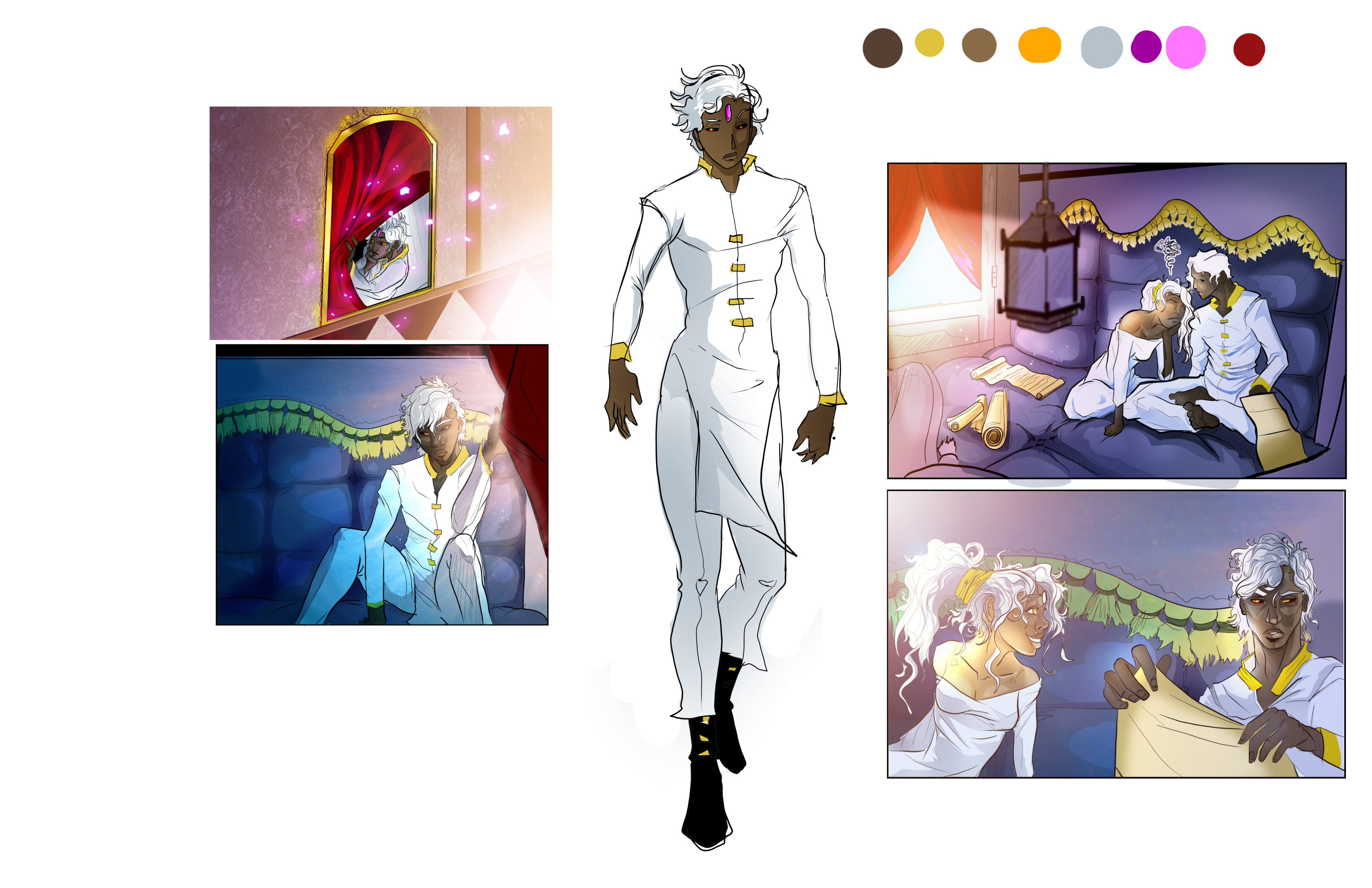
Every principal character was built through a full turnaround front, side, and back to train the StoryTech tool.
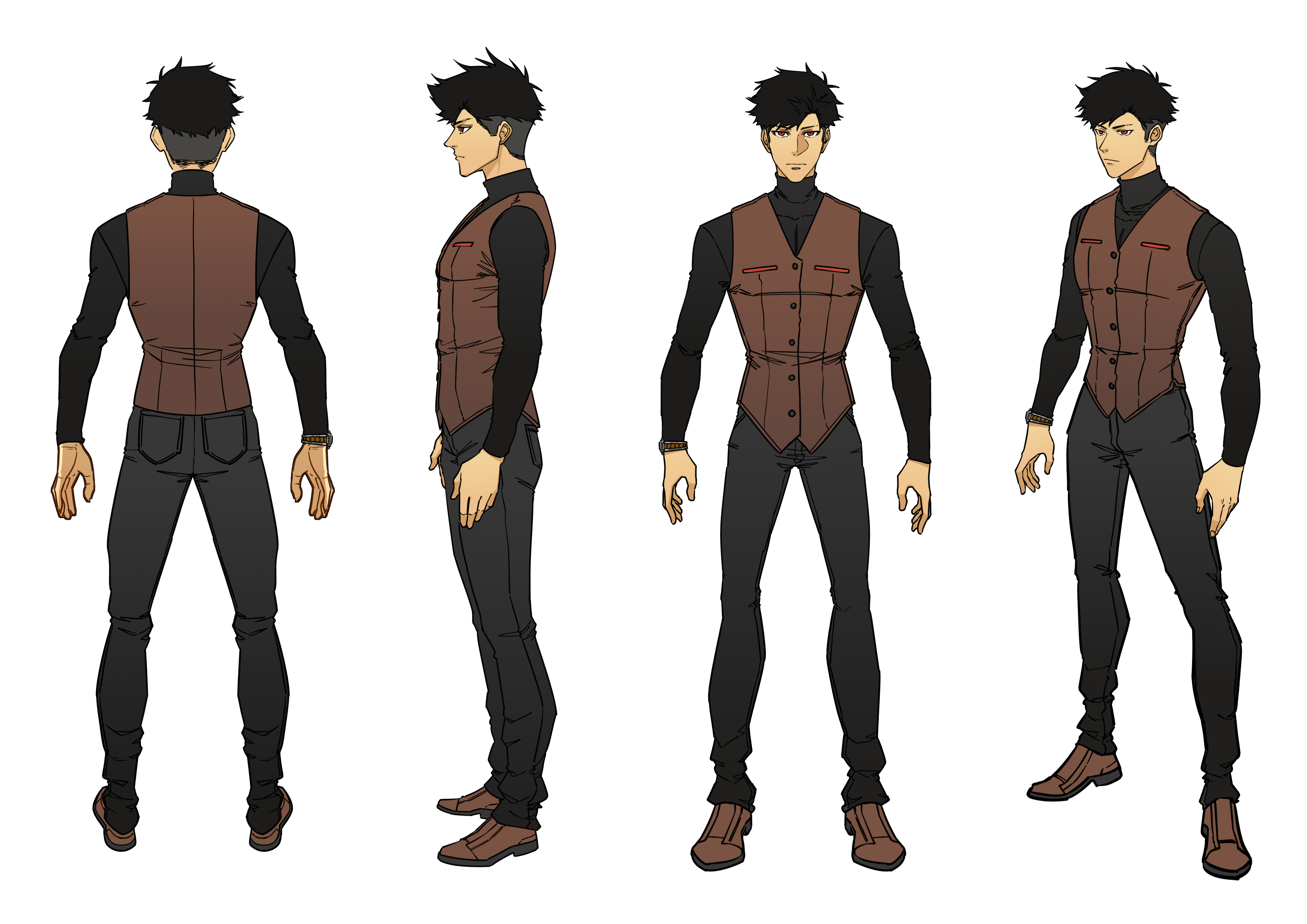 CLAUDE, COLOR TURNAROUND
 AVON, COLOR PASS
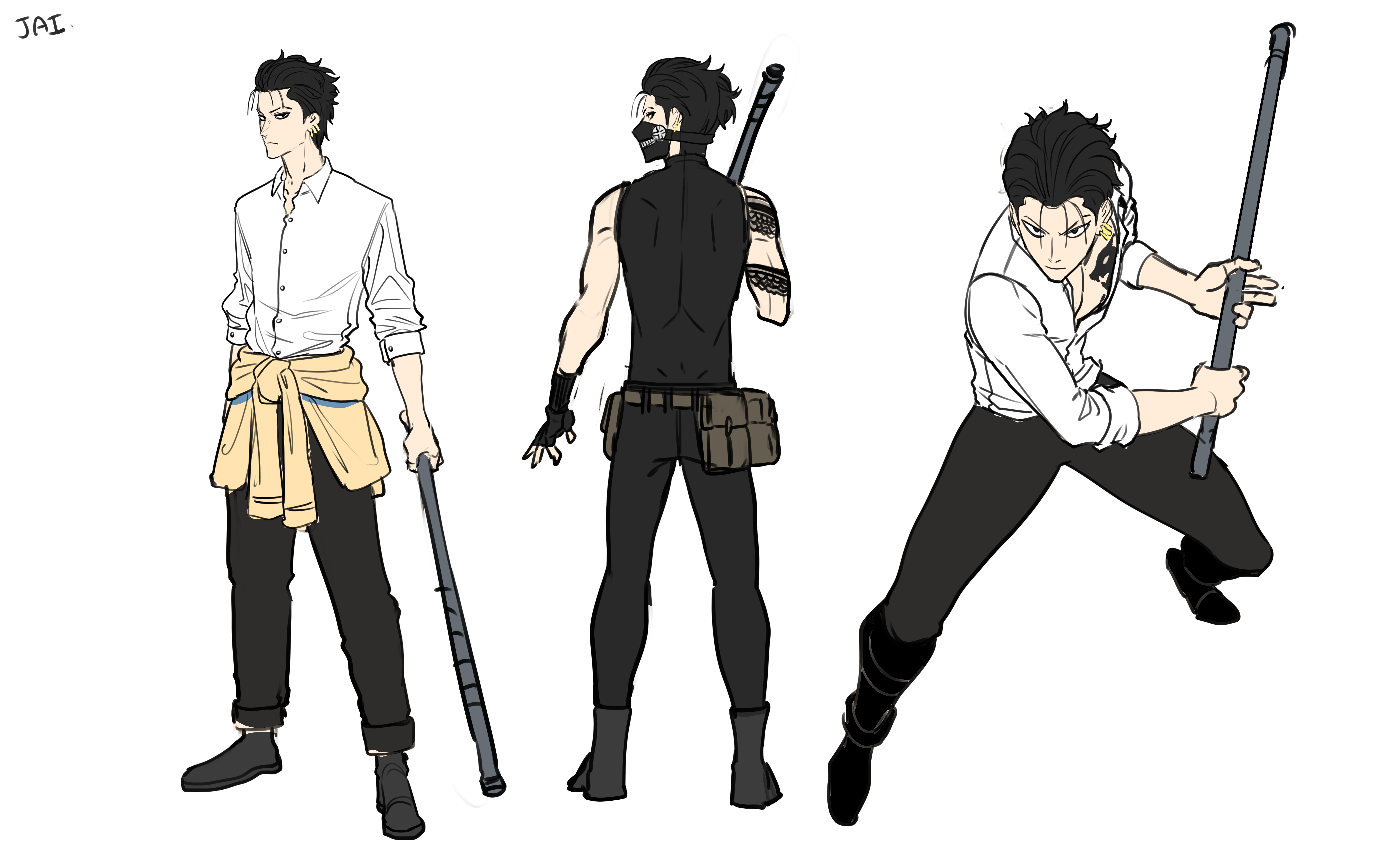
The same process scaled across the rest of the cast: quick color concepts to lock personality, then clean turnarounds for production.
Scenes & Story Panels
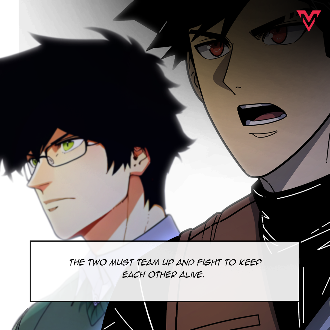
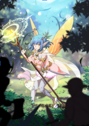
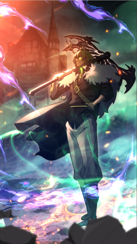
Each panel was integrated by using our Storytech AI creation tool that allows artist to use AI as it was meant to be, a tool.
Other Examples of Creation Tool Implementation
Giving generative storytelling a visual language.
CREATIVE DIRECTION · AI STORYTELLING · COMPOSITING · VISUAL SYSTEMS
The Story
FableVerse sits at the intersection of storytelling, fandom, identity, and generative AI. My role was to help define how that experience should feel creatively, not just how the images should look.
I worked across visual branding, prompt systems, product concepts, story-driven generation, and quality standards to help create an experience where users could enter a world, create characters, and generate imagery that felt more intentional and cinematic rather than random.
The Central Challenge
How do you turn an AI image generator into a storytelling experience?
Generation is more engaging when users are given context, narrative, and inspiration before they are asked to create.
Years of production compositing gave me a working method for creating scenes from piecing foreground and proportion correction, background reconstruction, matching light direction and color temperature between subject and environment, building depth in layers, and grading the whole frame to sit together. That craft is what closed the gap between what the model produced and what a cover needed to be.
Story-Driven Generation
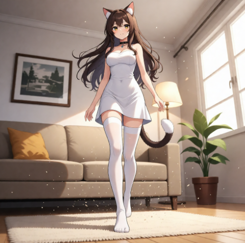
Outputs produced under the prompt framework: cinematic framing, clear subject hierarchy, and environmental interaction instead of broad style descriptors.
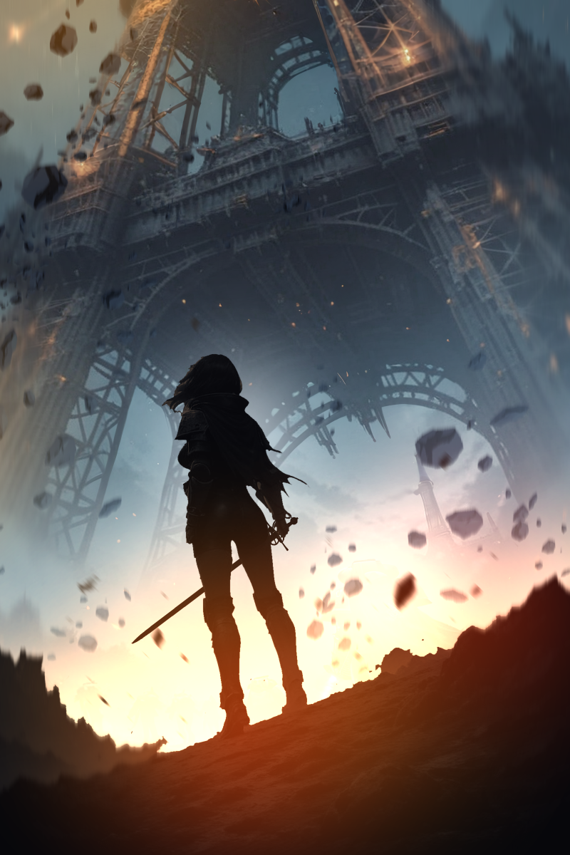
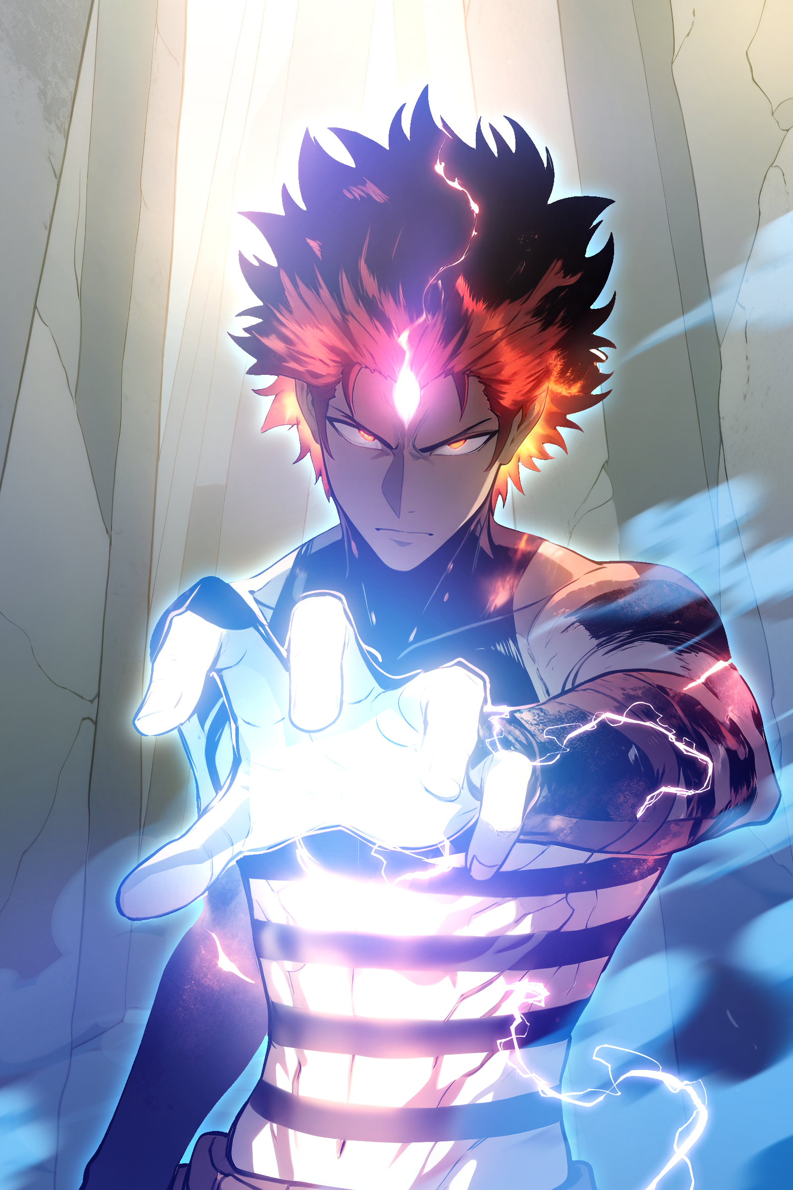
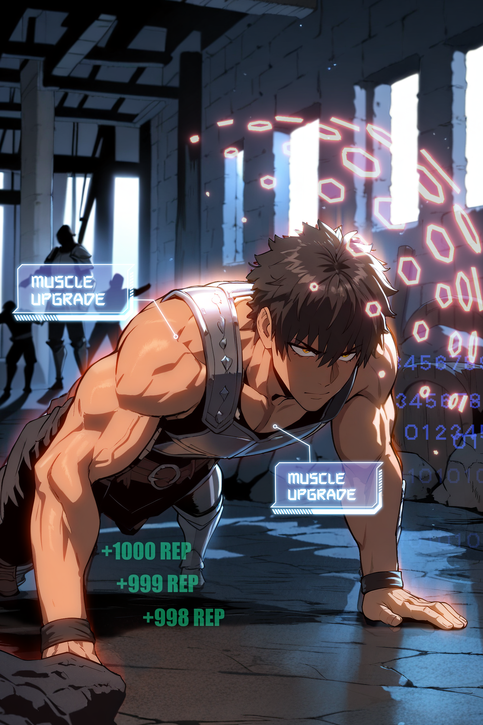
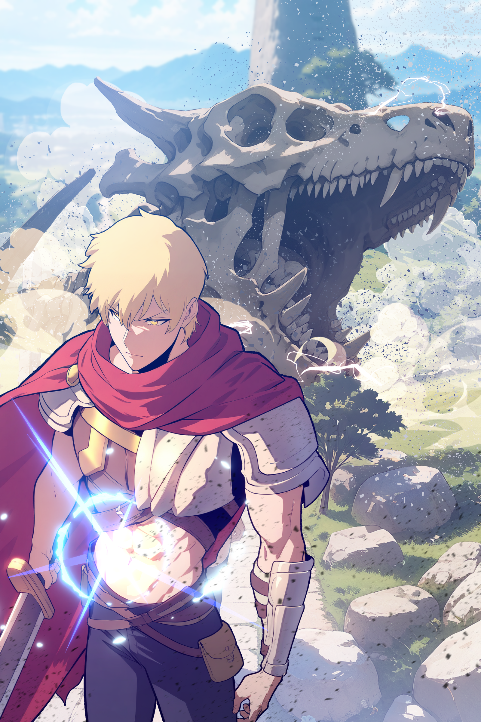
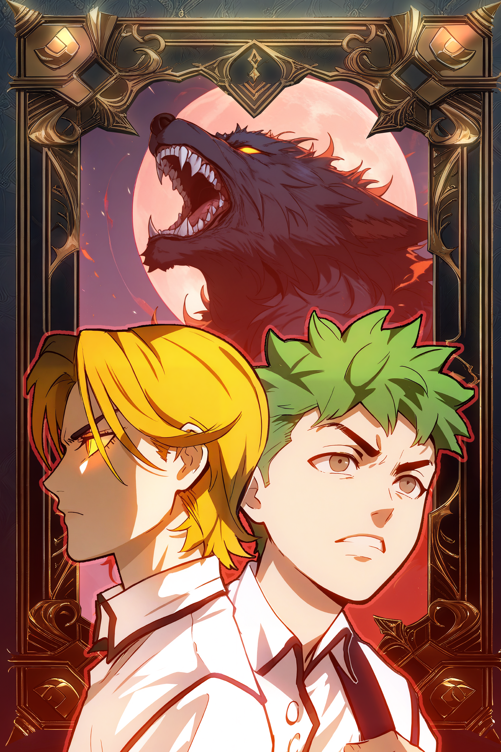
Generation was the starting point, not the finish. Every cover here was composited by hand: I built them in layers, correcting anatomy and proportion, repairing hands and faces, rebuilding backgrounds and set dressing, unifying light direction and color temperature between the subject and the environment, adding depth through atmosphere and grain, then finishing with color grading and typography. The prompt framework got me a usable plate. Compositing is what made it a cover.
The Creative Problem
Identity
The platform needed a recognizable visual language that could support many genres and worlds without feeling generic.
Discovery
Users needed clearer ways to understand what they could create and where to begin.
Generation quality
Prompts and model behavior needed to produce more cinematic, readable, and visually consistent outputs.
Storytelling
The product needed to move beyond isolated images and encourage users to think in characters, worlds, moods, and narrative experiences.
Scalability
The creative direction had to work across many Storypacks, characters, styles, and generation scenarios rather than one campaign or title.
What I Contributed
Creative product direction
Shaping what the user journey should be, not just what the UI looked like.
Compositing craft applied to AI output
I built the covers the way I build a webcomic page: in layers, by hand. Production compositing experience is what turned generated plates into finished, publishable art.
Visual systems
Rather than relying on broad style descriptors, I introduced structured visual direction around the language of the shot.
AI creative systems
Treating generation quality as something that could be tested and improved systematically.
Brand and experience cohesion
Making FableVerse feel like one connected ecosystem rather than separate tools.
Character Adherence
Holding the same face across every scene.
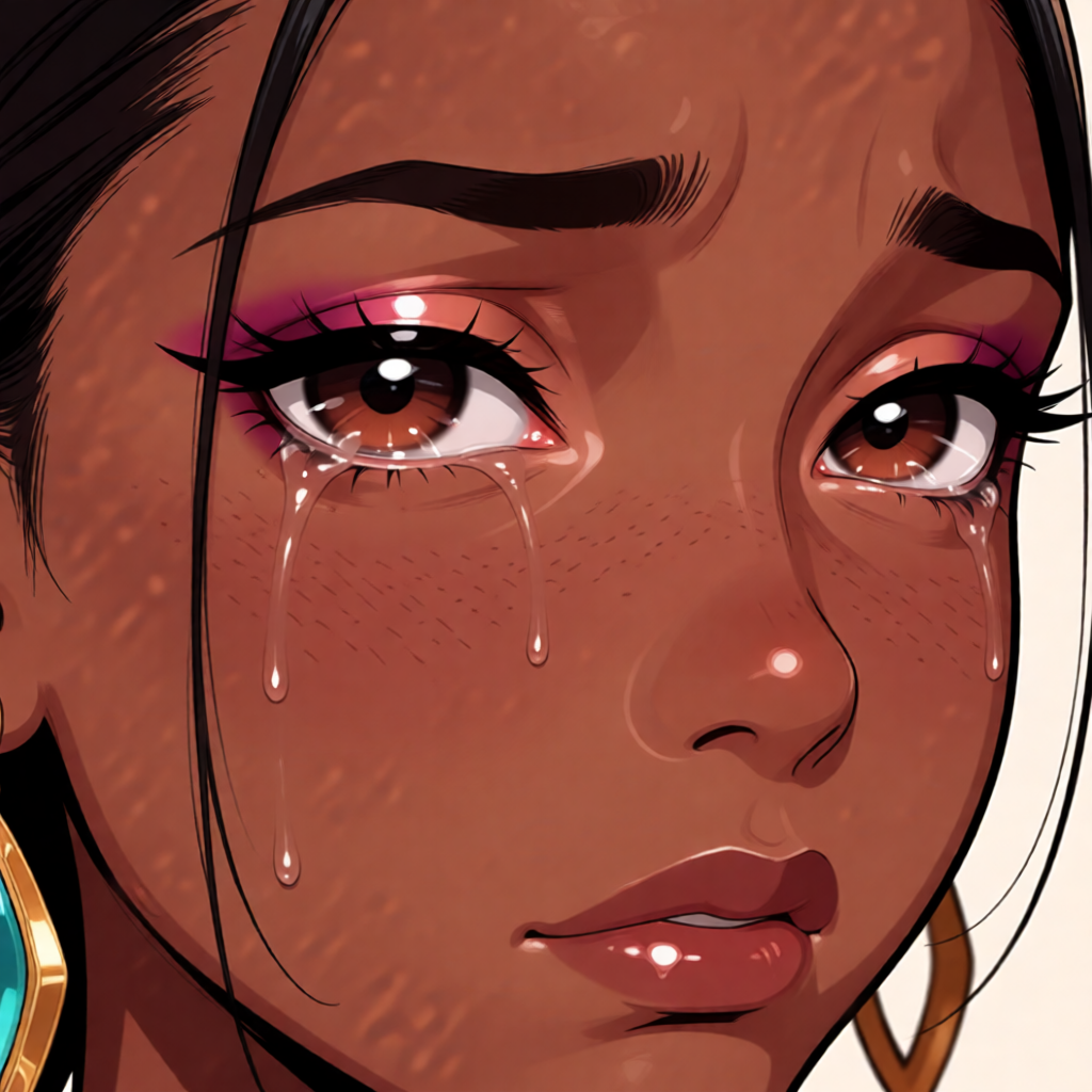
One of the hardest problems was character adherence. AI often strays from the reference image. The face drifts, features shift, jewelry and hair details get reinvented scene to scene, and the illusion of a persistent character breaks. I was part of the team that worked on solving that: defining what identity actually consists of, building the reference and feedback loop that holds it, and reviewing generations against the source until the character stayed itself.
Reference
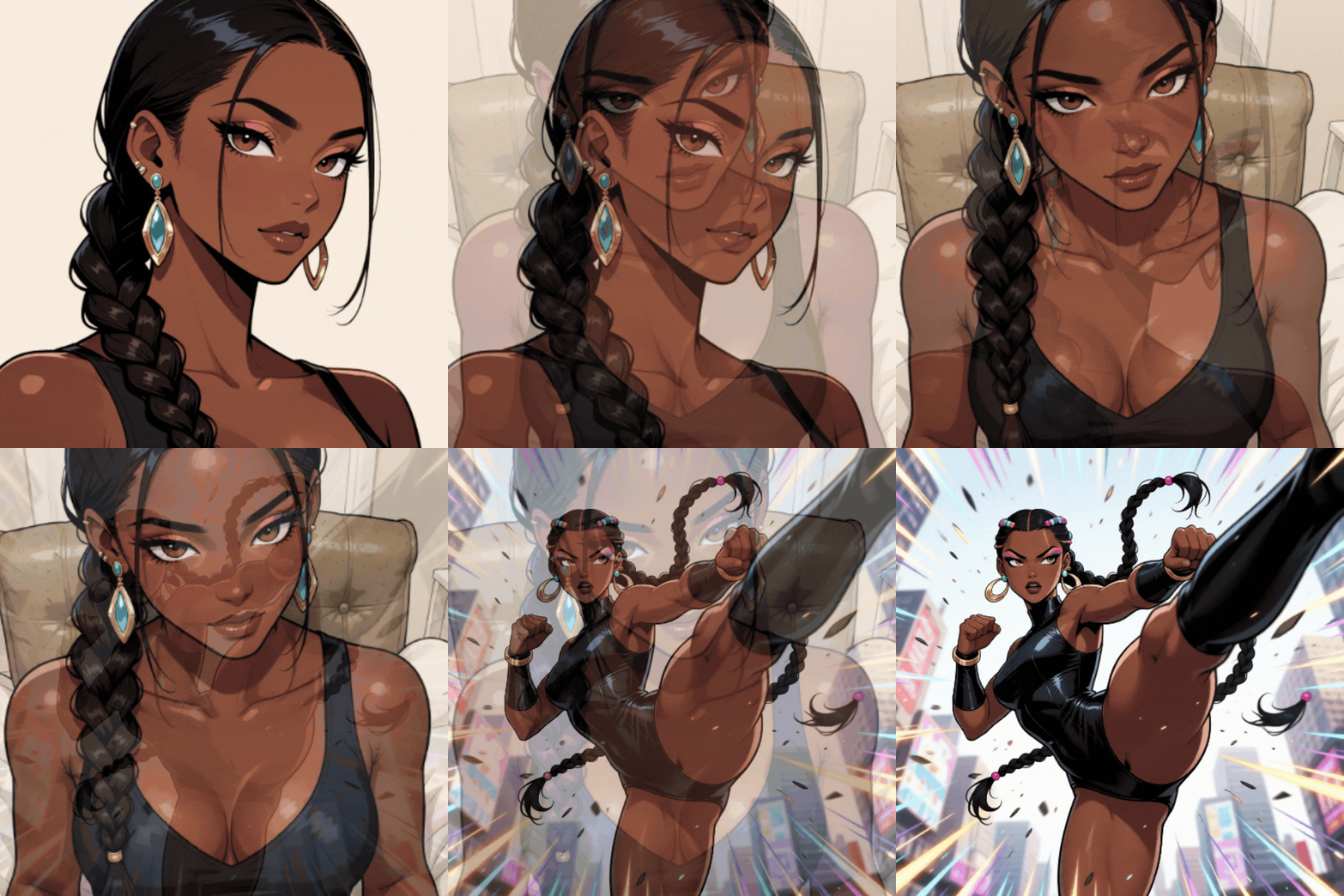
Generated scenes — same character, new context
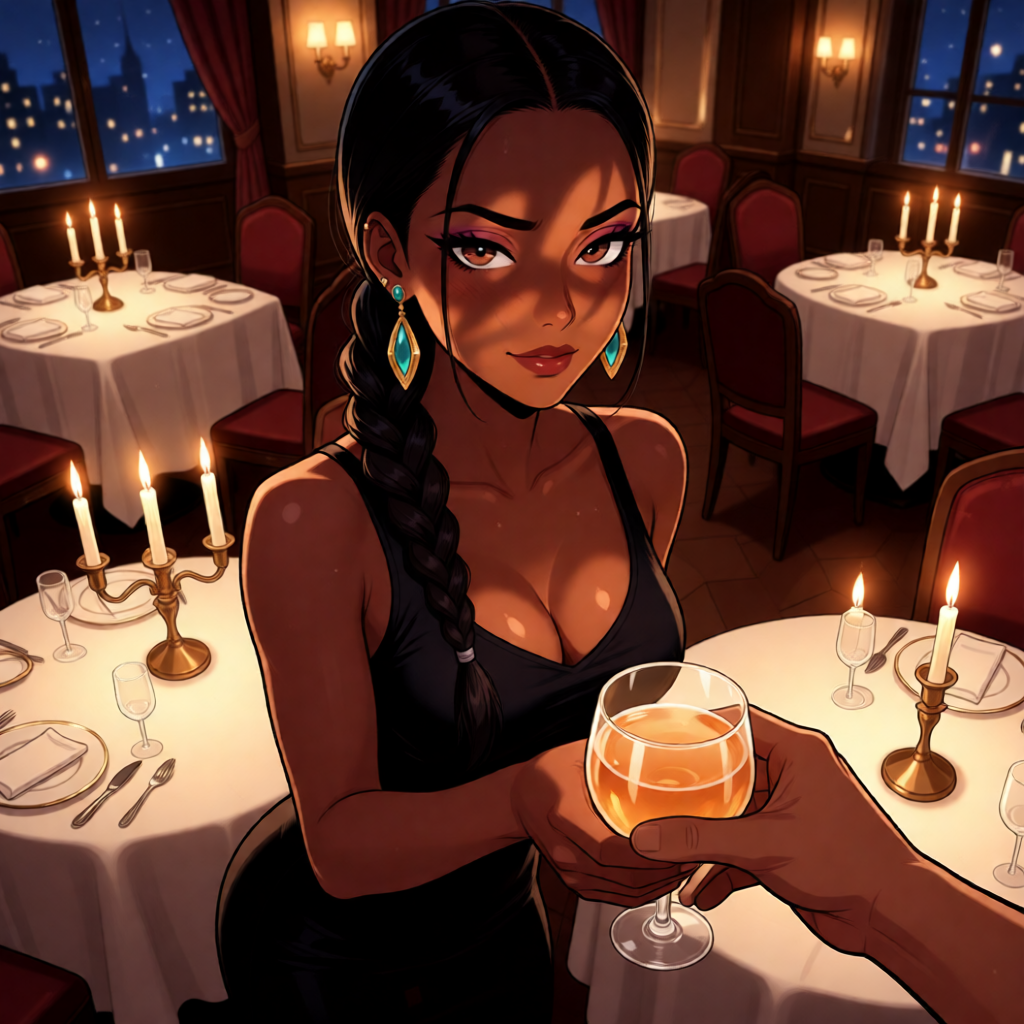
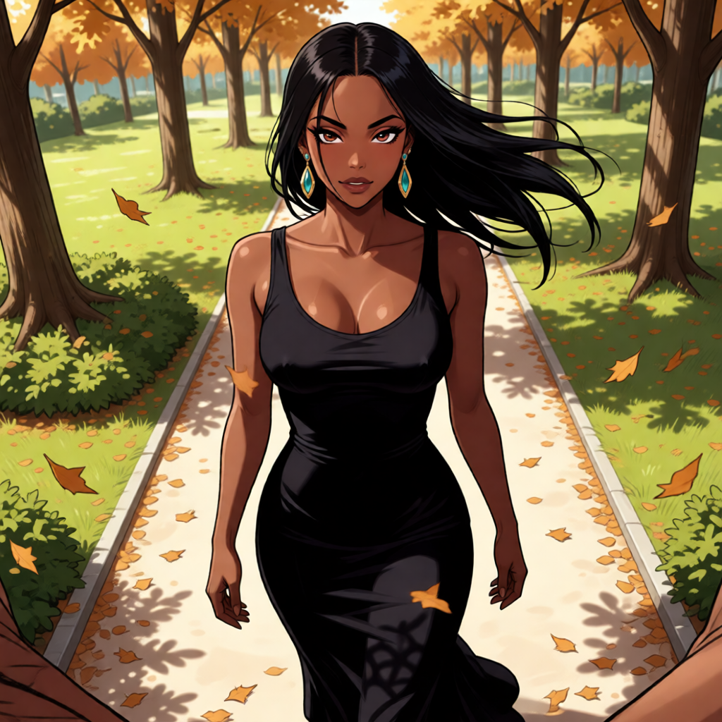
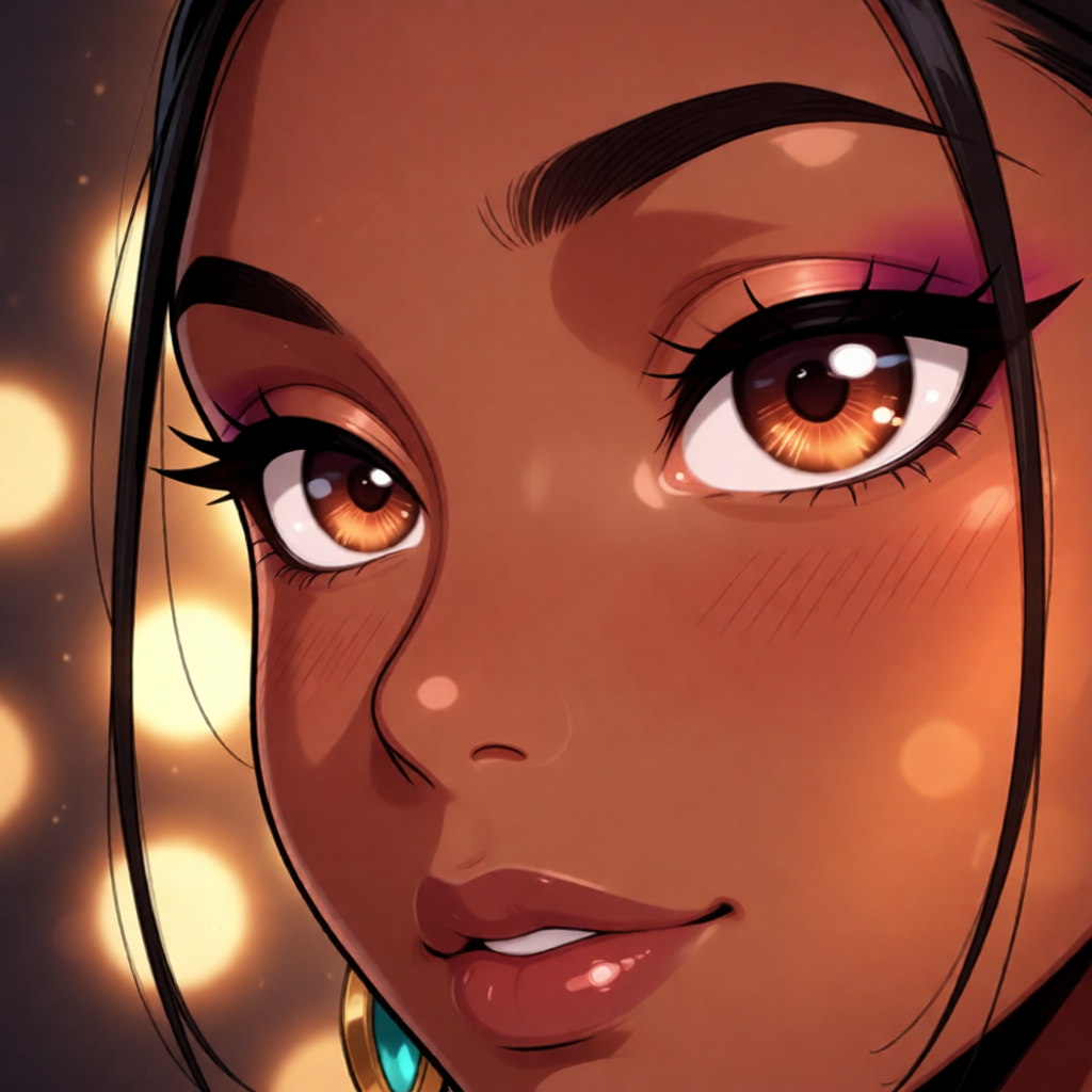
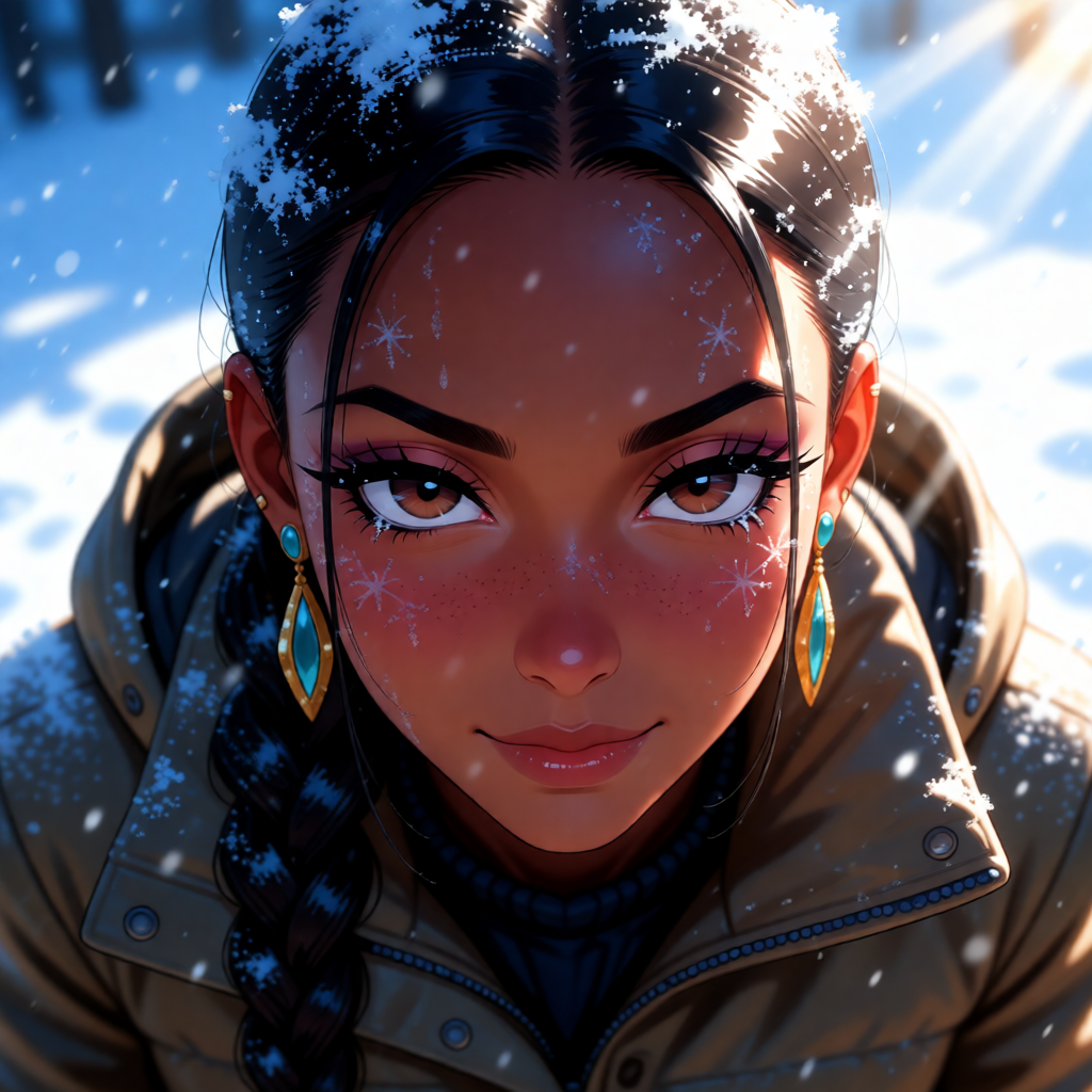
Outfit, lighting, environment, and emotion all change. The braid, the earrings, the eye shape, and the face do not.
Reference
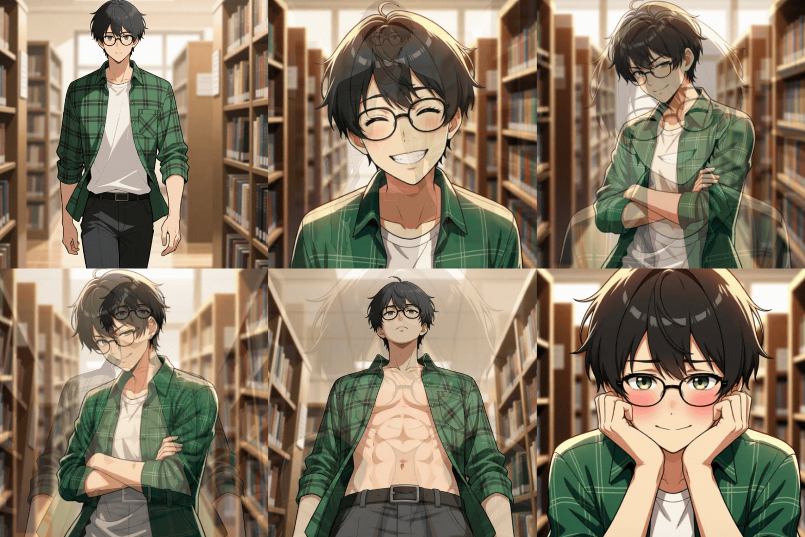
Generated scenes — same character, new poses and expressions

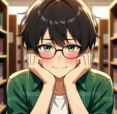
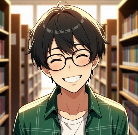
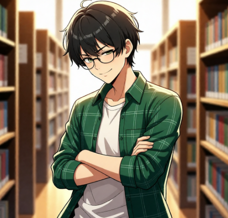
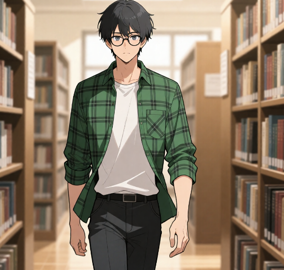
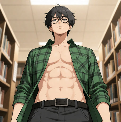
Shot size, camera angle, and expression range widely across the set. The glasses, hair shape, and plaid shirt stay locked to the reference.
Product Design Direction
Discovery & entry points
Users immediately understand that something new, exciting, and slightly forbidden has arrived, and it's easy to access. A hero banner, a glowing limited-run pill tag, and a filtered view with "Create Your Own" at the center.
Discover page & swimlane visuals
Differentiate the mode visually and emotionally it should feel like its own realm. A swimlane treated differently from the rest, with its own title, badge, and an embedded final card CTA.
In-chat experience
Make the transition feel cinematic, emotional, and irreversible a mode shift. Screen pulse, shimmer, subtle bloom, then the new palette loads. It should feel like the world changed around them, not a hard switch.
Narrative confirmation
Consent handled in the story's voice instead of system language: "The air shifts. Do you want to explore this connection deeper?" Same compliance effect, emotionally resonant.
Education & onboarding
Teach users how to activate it and why it's worth exploring a first-time pop-up and a three-panel visual tutorial covering typing naturally, confirming entry, and watching the connection unfold.
Branding & tonal unity
Every surface feels connected to one cinematic idea, not disjointed elements. The shimmer motif reused across chat, pop-ups, and the homepage banner; a micro language for UI copy — "Enter," "Continue," "Explore deeper" instead of "Enable."
SEE Engine
Using my expertise of webcomic storytelling in a chat bot.
In character-based chat applications, static images and generic generations break immersion. Users crave dynamic visual experiences that evolve naturally with their conversations images that respond to context, maintain character consistency, and feel truly alive. SEE Engine shipped inside FableVerse first, then became an API other platforms could build on.
Sequential storytelling
Users' journeys unfold in a compelling narrative flow with each click.
Understanding "chaotic" chat input
Extract emotions, action, and visual cues from what users actually type.
Consistency
Keep characters consistent across poses, emotions, and scenes.
Dynamic composition
Manga techniques applied to generate poses, camera angles, and emotions.
Rich, iconic animanga art styles
Trained from proprietary top webcomics and manga produced by market-leading artists.
Two working modes
Infer the scene from the last two messages, or take an image plus a single explicit command when the creator wants control.
Built On
Actual expertise in webcomic and manga production across dozens of original and licensed series — human-led generative pipelines tried and tested on FableVerse character chat, with continued daily tuning.
Quality Guidance I Wrote
Base images. Single character, clearly visible, good lighting, sharp details, minimal background clutter.
Image context. Feed the previous output back in as the next input so consistency holds across a sequence.
Chat context. The more detailed the message and context, the better the generation.
Matching art style. Strongest in animanga; other styles are matchable but results are sporadic.
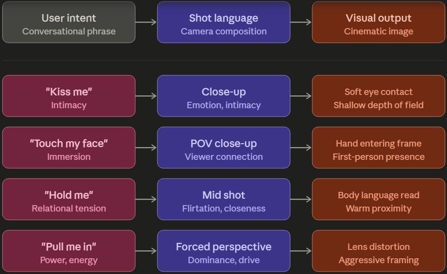
From Conversation to Camera
The mapping that lets the engine read intent as direction: each conversational phrase resolves to a shot choice, and each shot choice resolves to a specific visual result.
Writing Context That Works
Less effective
"Make it better"
"Change stuff"
"Different"
"Update"
Effective
"Change the background to a sunset beach"
"Make her look worried and add rain"
"Move to a cozy coffee shop interior"
"Add dramatic lighting from the left"
Be specific about what should change, include emotional tone when relevant, describe lighting and atmosphere, reference previous context when building a narrative, and write in natural language. The same cinematic vocabulary that guided artists became the vocabulary that guides the model.
FableVerse challenged me to think beyond individual images and toward the creative system surrounding them. I helped shape visual standards, prompt language, product concepts, and generation workflows designed to make AI creation feel more cinematic, guided, and story-driven.
Through projects like IsekaiMe, I explored how users could move between guided Storypacks and fast open-ended generation, while building clearer visual language around camera, composition, movement, and atmosphere. The goal was to turn generative AI from a novelty into a creative experience users could understand, explore, and return to.
Resident cover artist for a community-written fiction platform.
Cover Art · AI Illustration · Serialized Fiction
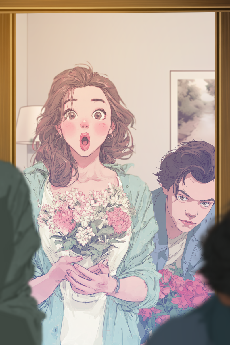
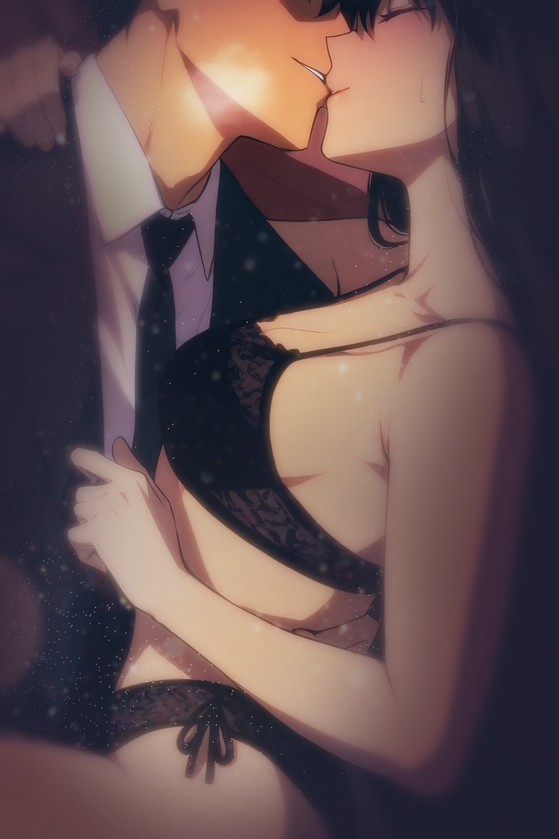
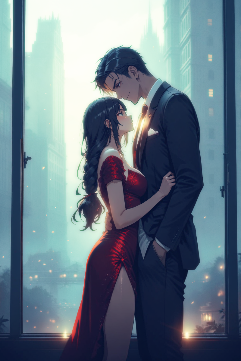
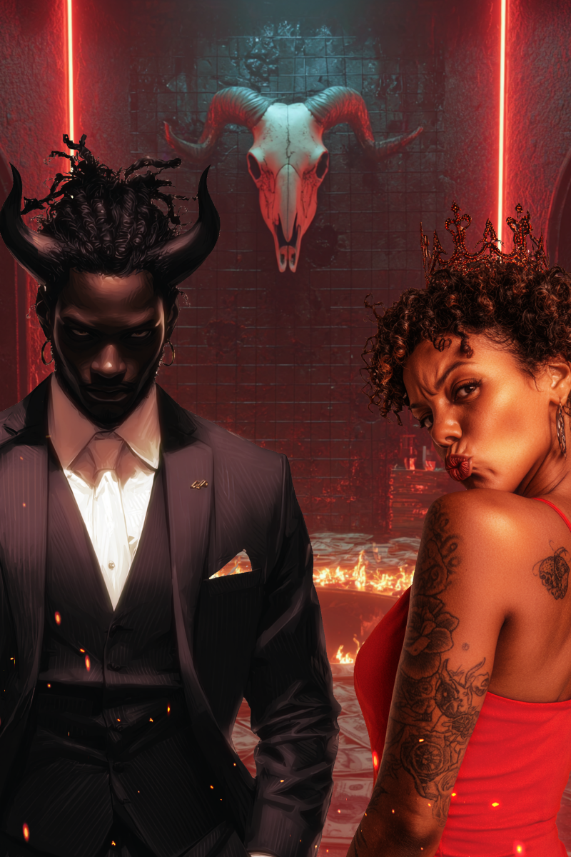
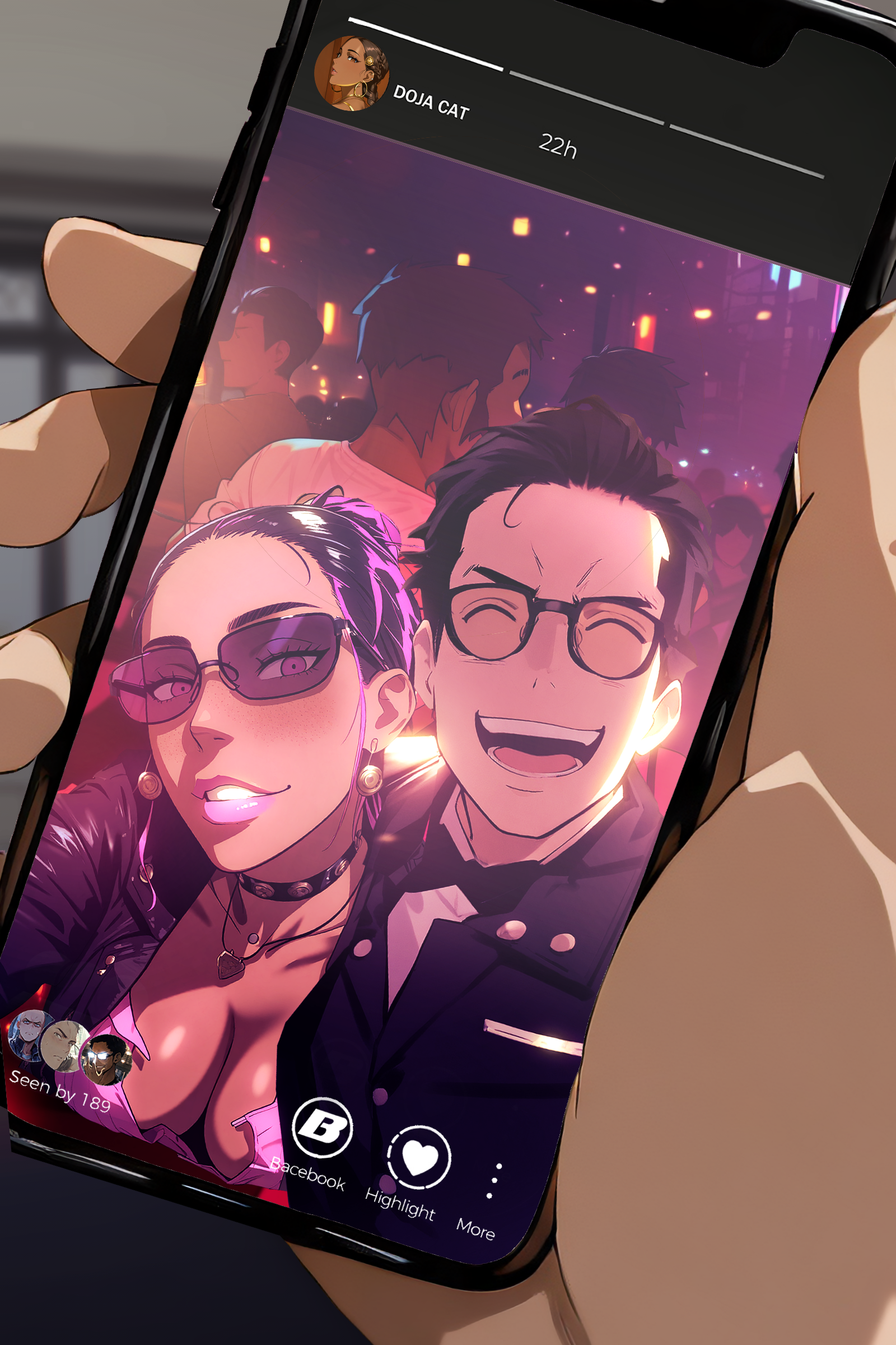
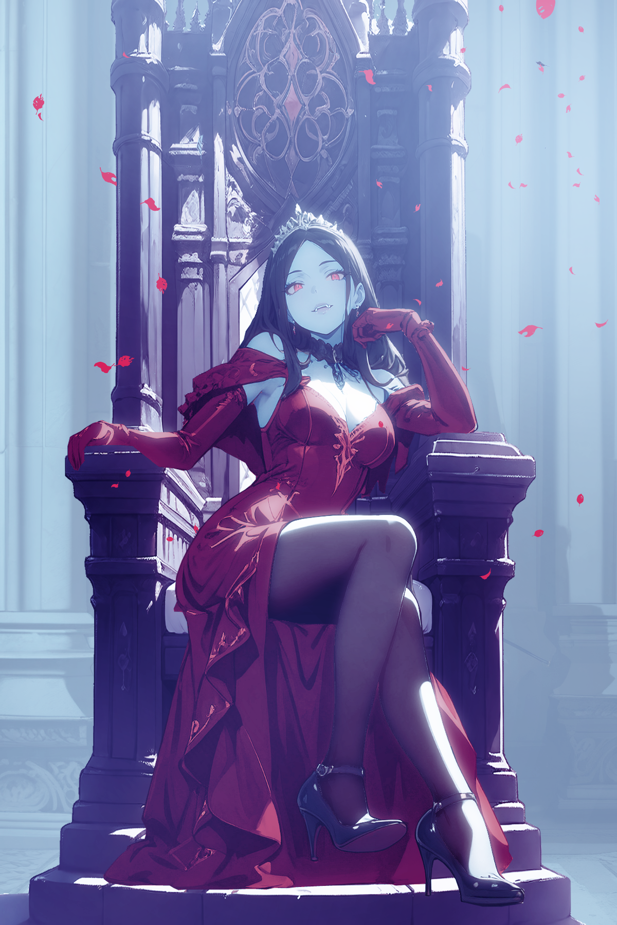
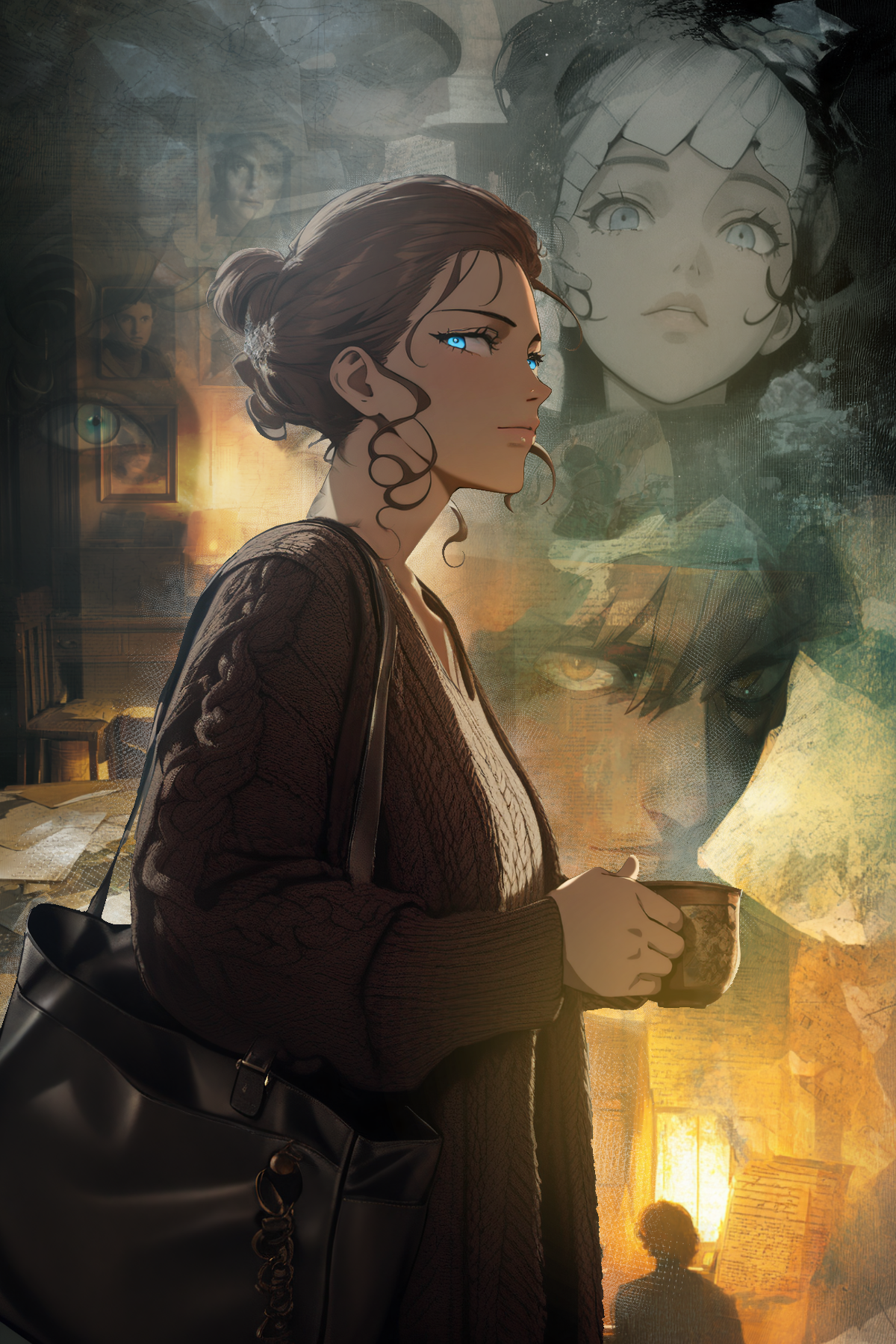
The idea behind Strands is that their stories come alive through community collaboration. Authors write gripping chapters that end with pivotal choices, and readers vote together to decide what happens next. I was in charge of creating engaging cover art.
Strands on Google Play →The Cover Art Program
"Cover art is such an important piece of a story, but unless you're an artist yourself, it can be hard to find or create the perfect piece that captures the story's essence. One of our beliefs is every writer deserves a beautiful piece of art for their story."
Strands CEO, announcing the cover art program
Each month, authors submit their stories for consideration and the community votes on which one receives the cover art benefit. The winning author then collaborates directly with me on a custom piece. Original work and fanfiction are both eligible the program supports all human-authored content.
Selected Covers
Raising creative quality through systems, language, and leadership.
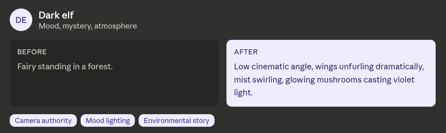 Prompt system
Built and rolled out a shared evaluation framework so art quality could be reviewed, taught, and held consistent across the team.
At VoyceMe and FableVerse, I developed creative systems that transformed inconsistent visual output into scalable, production-ready quality. By combining traditional art direction, cinematic storytelling, and AI-assisted workflows, I built repeatable processes that enabled teams to produce higher-quality creative work with consistency across products and pipelines.
A major part of this work was proving that creative quality could be measured, taught, and scaled.
Explore the creative system →Creative Leadership
Founded and led three QA functions from the ground up, and set the roadmap that took AI-tool integration from pilot to over 80% of production across four quarters.
Quality Improvement
Built the evaluation framework used to review art quality, teach standards, and validate prompts across repeated generations rather than judging a single successful result.
How I approached it
{{ row.challenge }}
{{ row.approach }}
{{ row.outcome }}
Have an ambitious idea that needs a visual direction?
I help teams build stronger worlds, sharper brands, and more effective creative systems by combining visual fundamentals, art direction, storytelling, and emerging technology.